SN Reports Docs
Getting Started
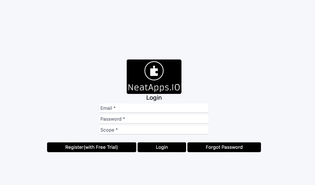
Once you download the module and install it you will be greeted to this screen. If you don't have an account you need to register for free. You will get a 2 week free trial with the registration. If you encounter any issues with the free trial please contact us.
During the login and Registration you will be asked to provide a Scope. The scope is a a word/phrase you can set which can be used to separate the account into different environments such as PROD, QA, DEV if nessesary or if you have multiple odoo instances that require different configurations on each environment. Scopes will be covered additionally in the documentation in more detail. To start you can create a scope and write it down at a safe place.
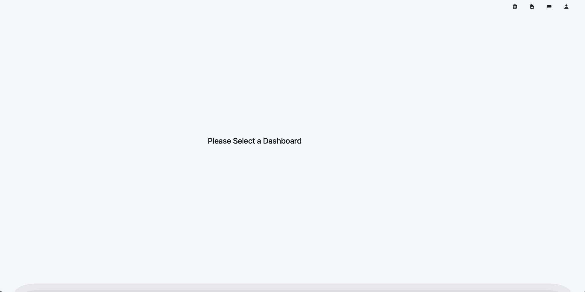
Once you are logged in you will see this screen
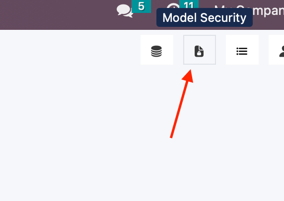
Model Security
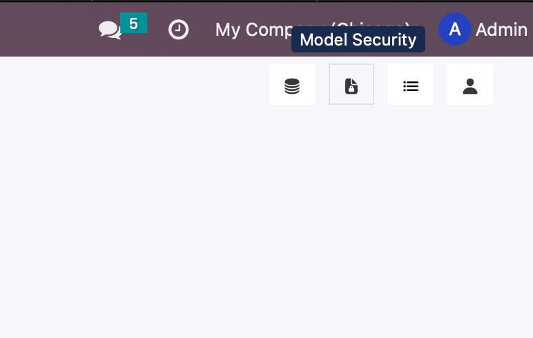
Once we are logged in the first thing we want to do is to give access rights to the models we want to use in the dashboards. We provide an additional security layer to that of Odoo to only expose the models and columns you need to the groups you want to.
Model Security is only available to users that have full access to the sn.custom.dataset and sn.access.right models in Odoo.
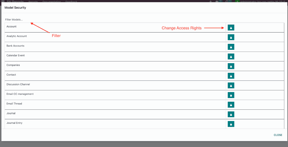
Once Model Security is open you will see this window popup. You can use the filter to find the model you want to use and then click the model access rights button to change the security settings.
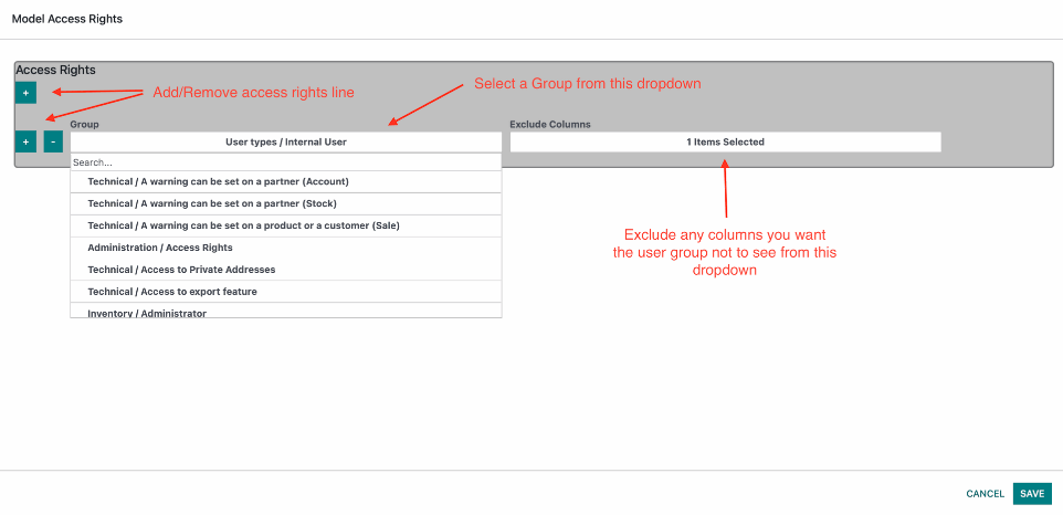
inside the Model Access Rights add a group and if there are any columns you want to exclude from being seen please select them.
Dashboards
Create/Edit Dashboard
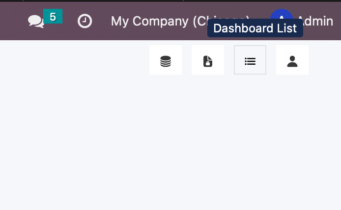
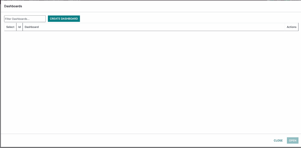
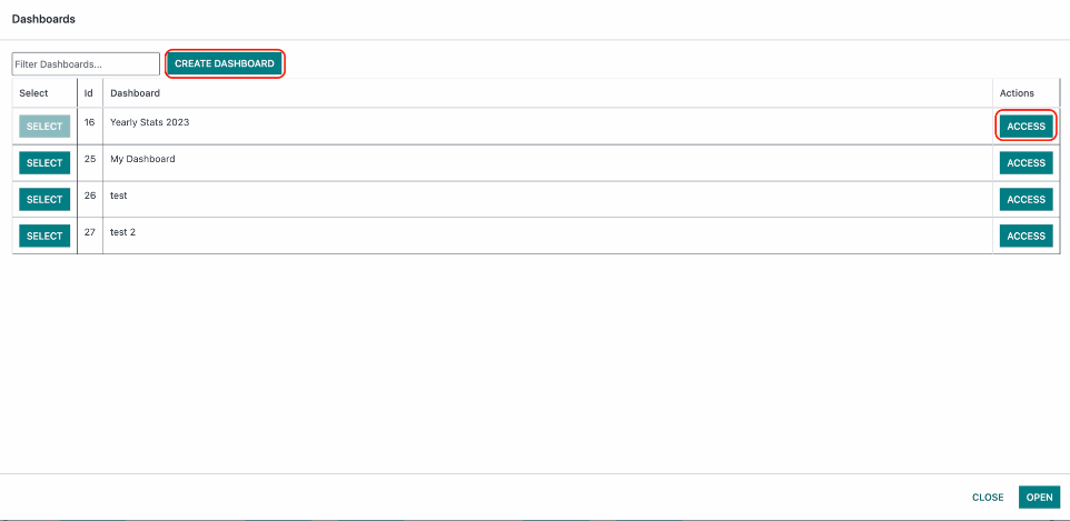
Click on the Dashboard List button at the top right corner.
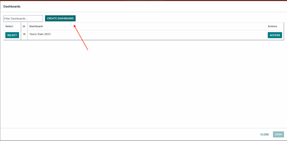
Click on Create Dashboard.
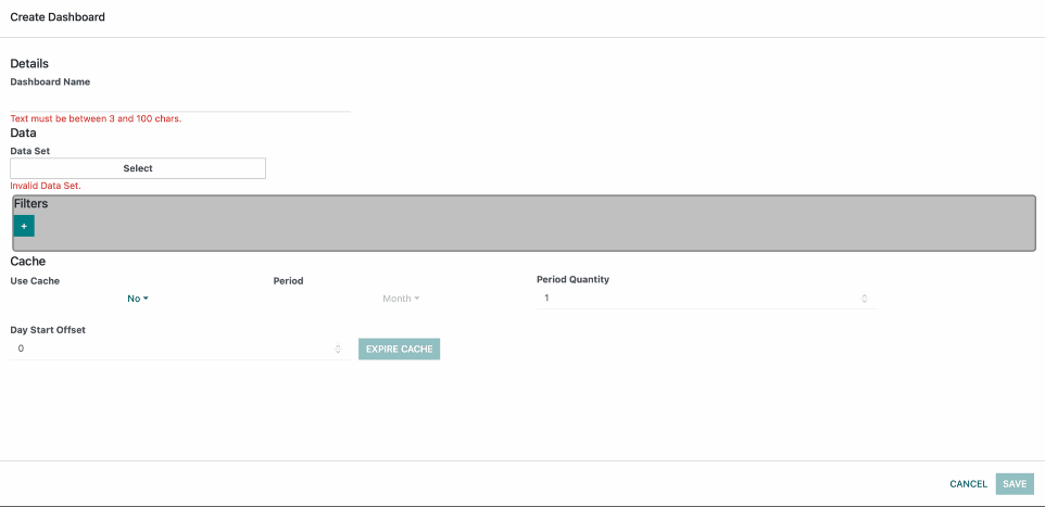
This will bring up a form where you can write a Dashboard Name, select a Dataset and filter the dataset.
Here is this example you can see a list of Datasets which are the standard Odoo models which can be added to the dropdown trough the Model Security modal as shown in the section above. We can also create Custom Datasets which will be covered later.
Filters which are a way to control what data is seen within the widgets.
Cache section allows us to speed up the retrival of data for large amounts of complexly filtered data. It is turned off by default. we will cover it in detail in its own section.
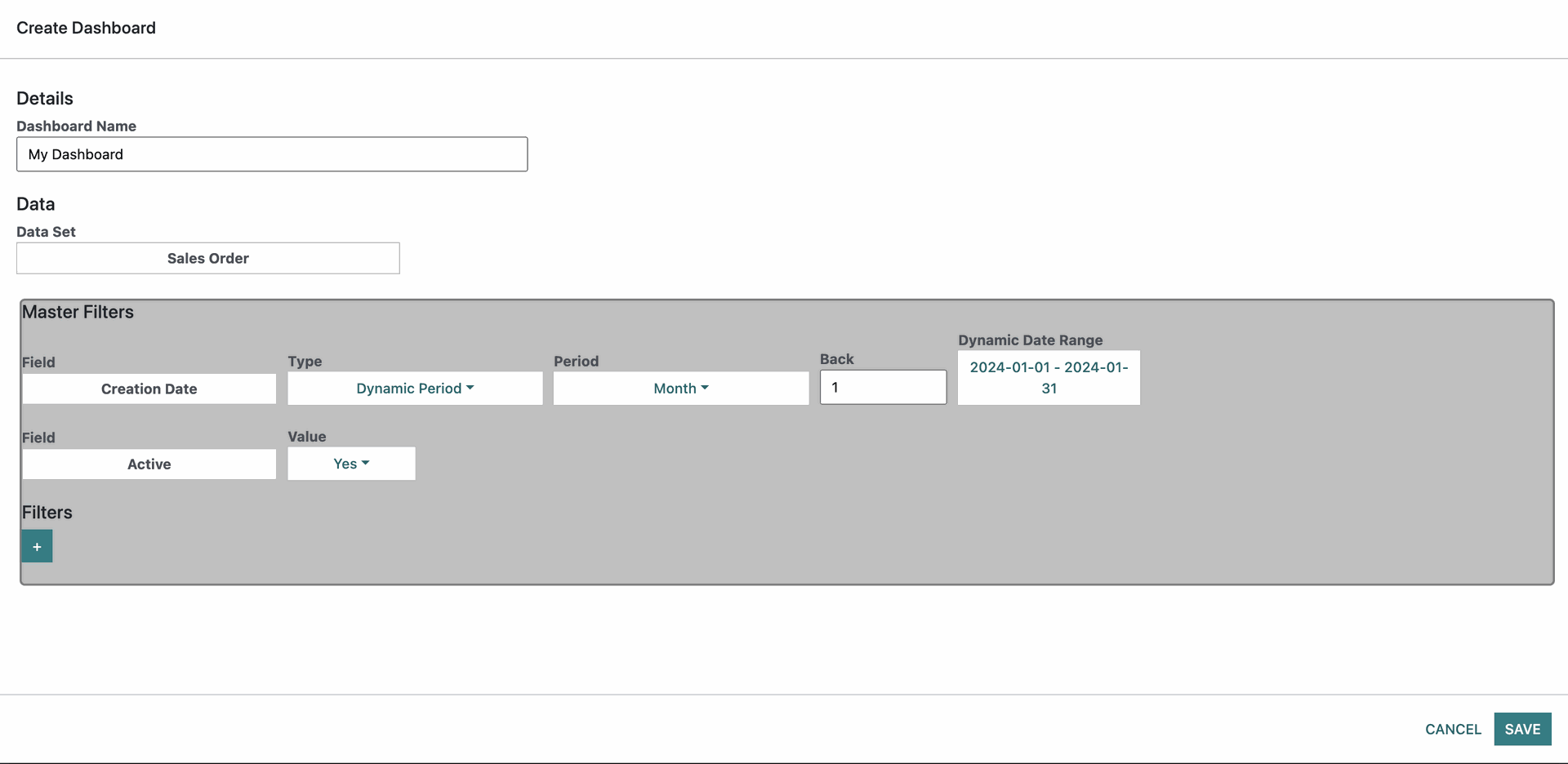
Once you select a dataset if the dataset has a Creation Date field or an active field these will be added as Master filters which will be applied to the dataset by default. We will cover filtering at a later topic but for now just know that this filter takes all of the data from the previous month relatively to the current date. So if its 05-01-2024 the selected date range will be 01-12-2023 to 31-12-2023. The active field represents either if the field is active in the context of Odoo. So once you selected the Dataset and are ready click Save.
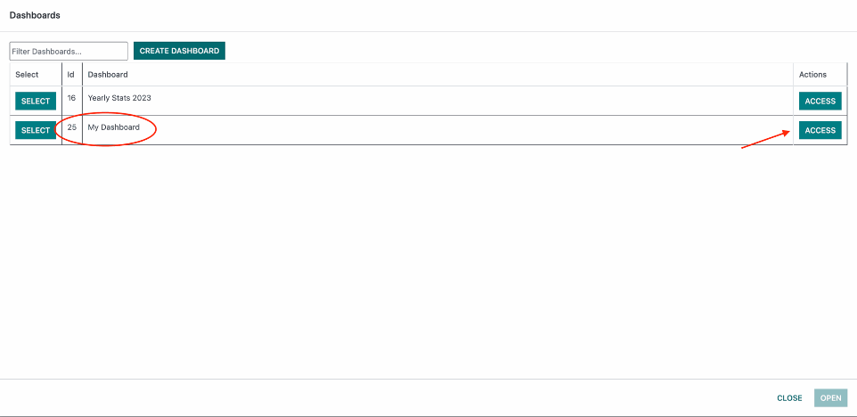
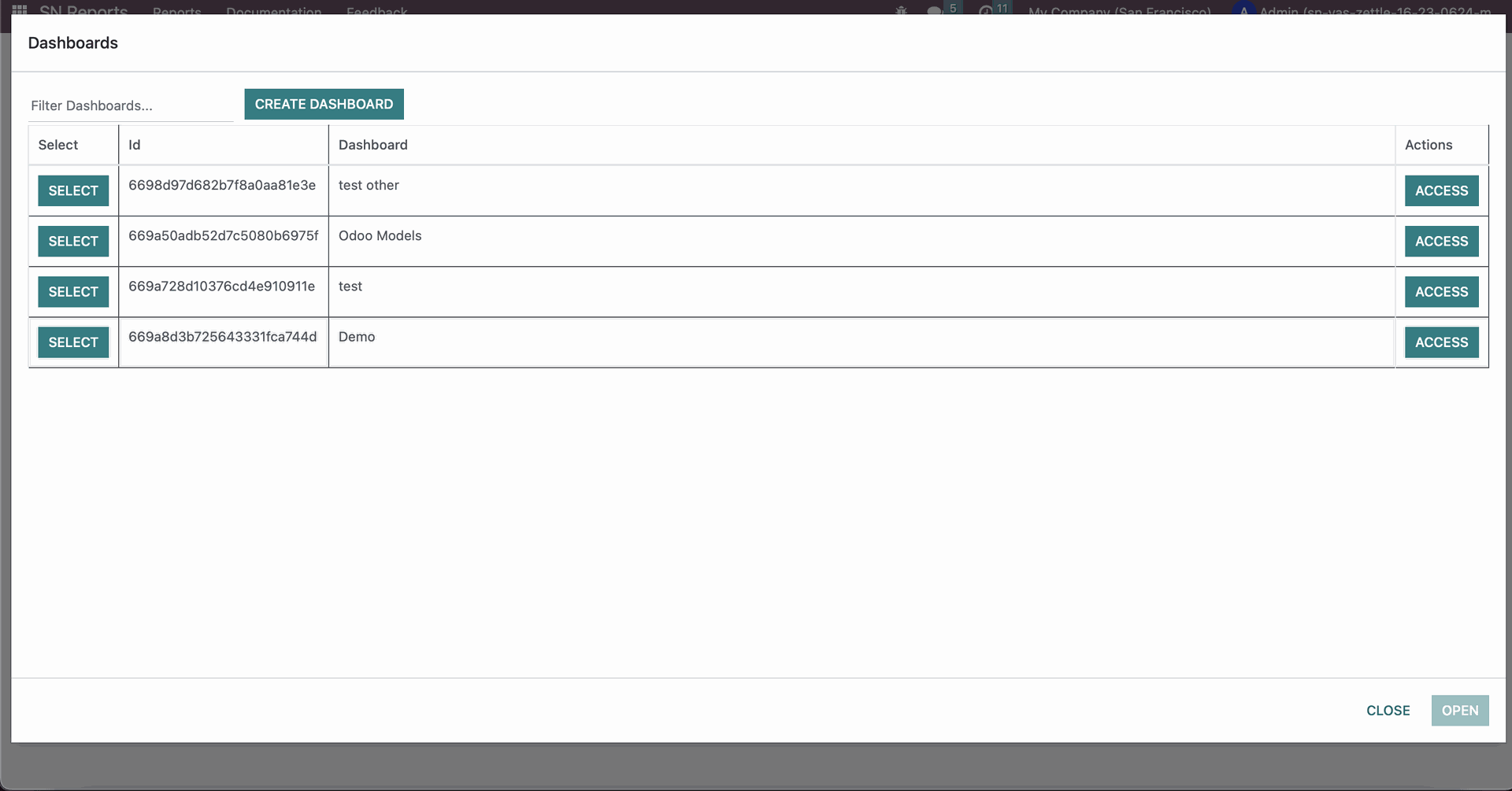
Back in the Dashboards List the new dashboard will appear with the name you set and an Id as a unique identifier. You can also see an Access button which is used to determine who can see the dashboard you created. Go ahead and open it.
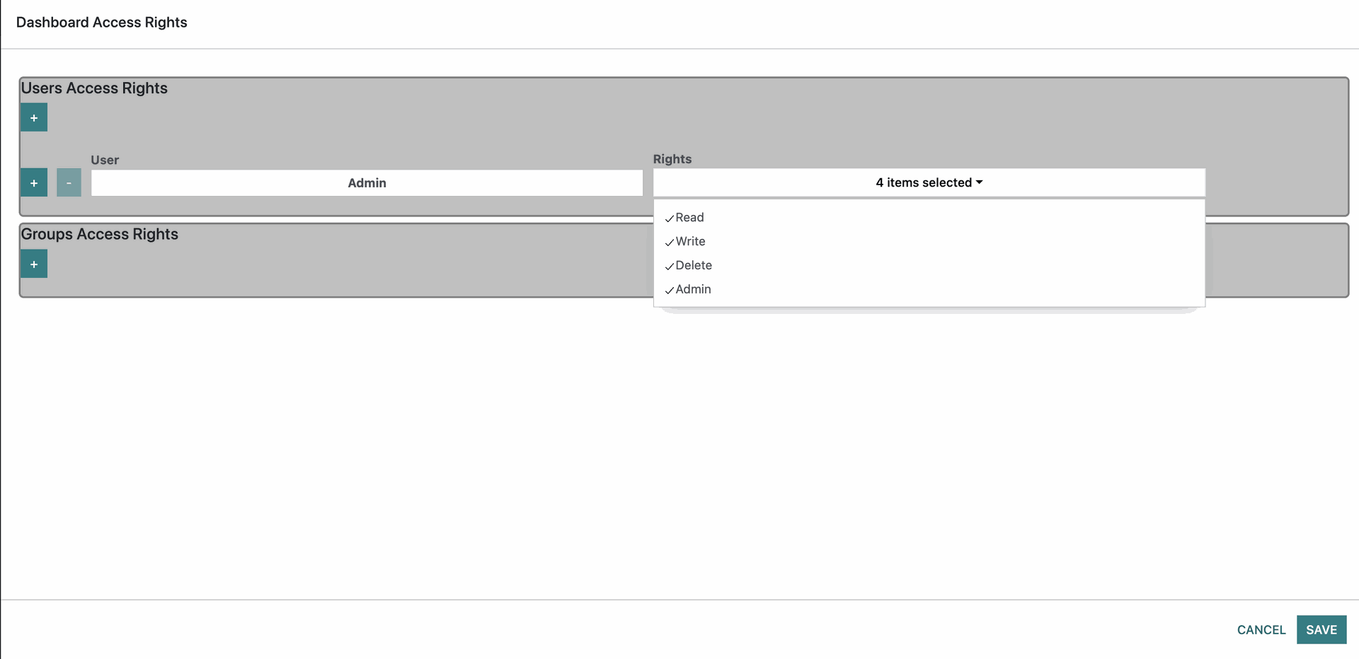
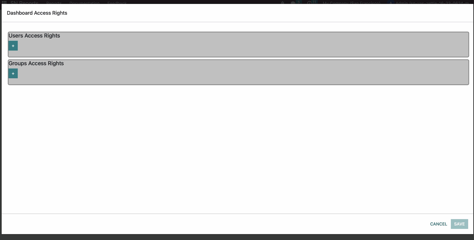
Once its open you will see that your user is the only user who has access rights and what access rights it has.
Read - View the dashboard and its widgets.
Write - Edit the dashboard or widgets and save changes.
Delete - to delete the dashboard and/or widget
Admin - to be able to access this access rights menu.
It is required that there is at least one user or group that has access at any time. you can add access to another user or group using the respective + button.
It is Recommended to have read access if you want any other access right.
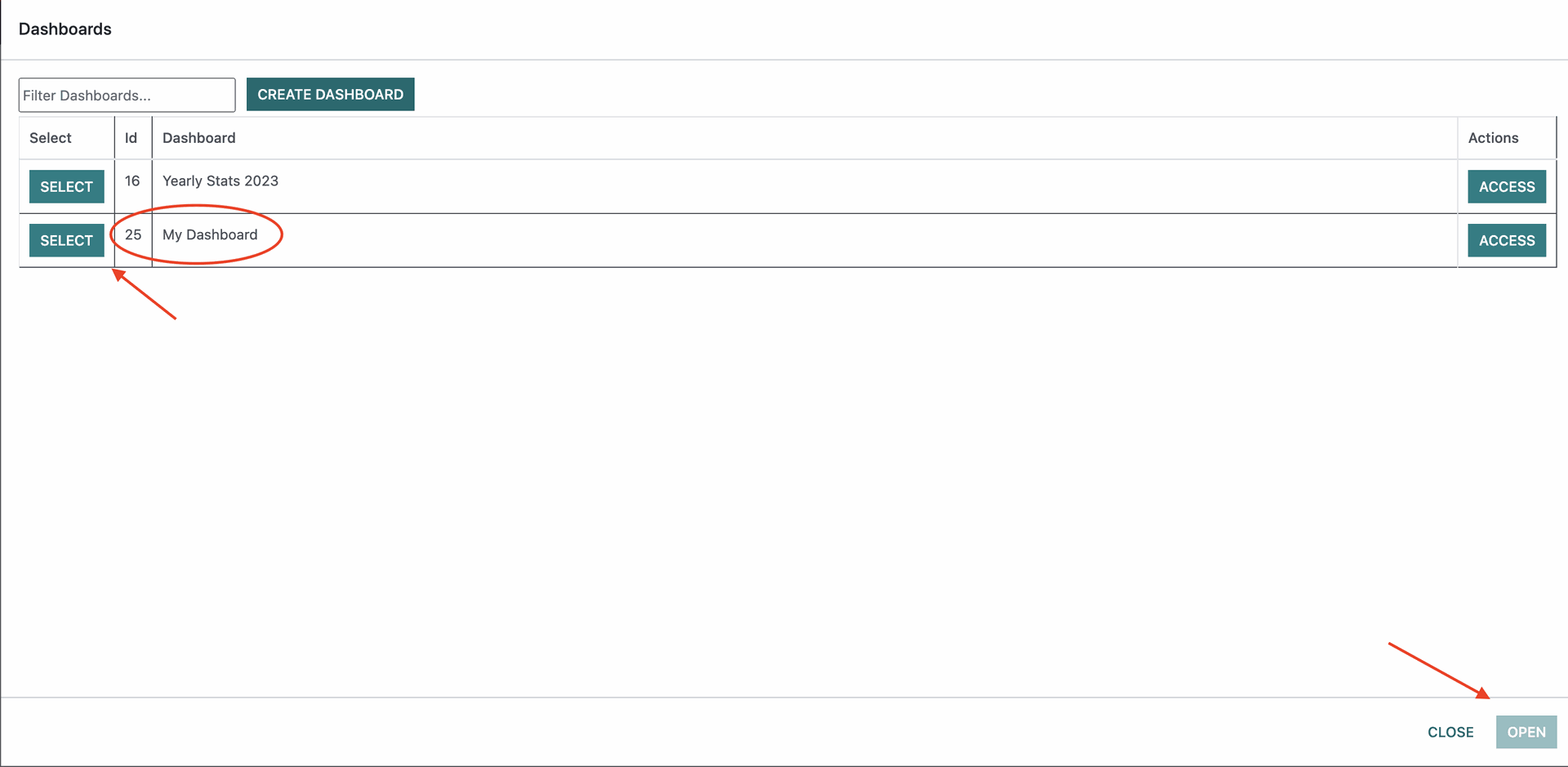
Once you save the access rights you selected you will be brought back to the Dashboards List. Select Save and Open
Dashboard Control Center
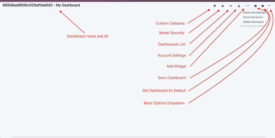
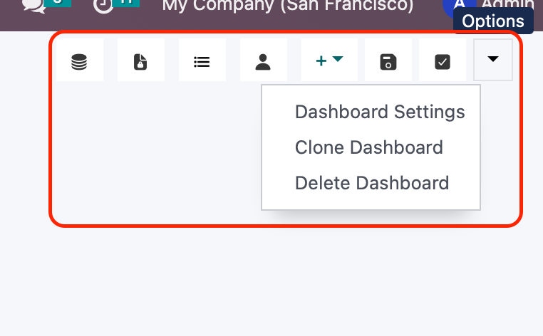
Once the dashboard is opened you will be treated to a blank page with the control center with the dashboard name and the following buttons.
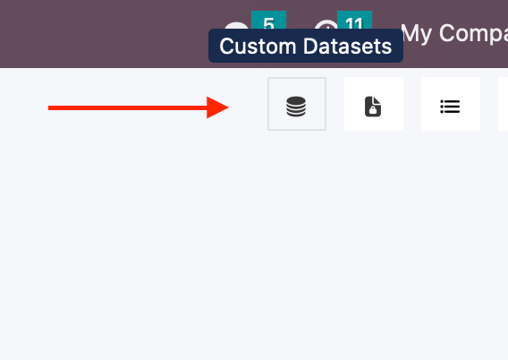
1. Custom Datasets - Create Custom Datasets what combine data from multiple tables with advanced column calculation options and access control
2. Model Security - Control the access rights for odoo models inside the dashboard.
3. Dashboard List - Select, Create and Access Control dashboards.
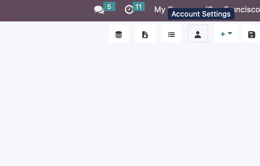
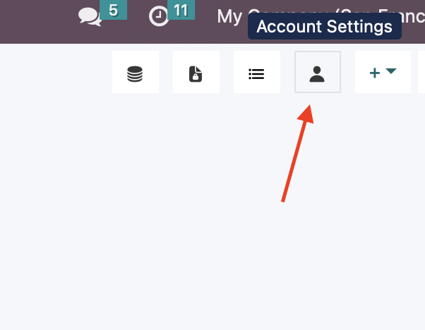
4. Account Settings - Change Scope, Add Allowed Users, Change Account Details
5. Add Widget - This Allows you to create widgets (Chart, Grid or Summary)
6. Save Changes - Saves any changes made to widgets on the dashboard.
7. Set Dashboard As Default - This is an option that when selected for the dashboard it will load this dashboard by default when the app is reopened.
8. Dashboard Settings - Edit the dashboard just like you created it.
9. Clone Dashboard - Create a complete copy of the dashboard and all its widgets
10. Delete Dashboard - Delete the dashboard and all its widgets
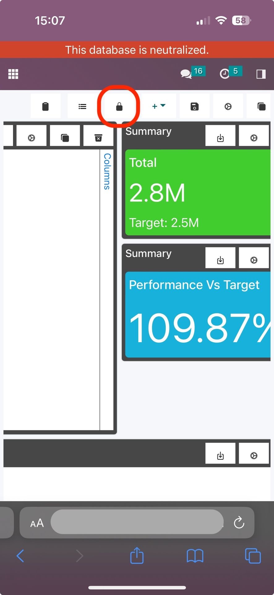
There is one more button available on mobile devices which is the Lock/Unlock button.
This button locks the widgets so they wont move on mobile view and when you toggle it allows you to move them.
This is to provide an improved mobile experience.
Widgets
Create/Edit Widget
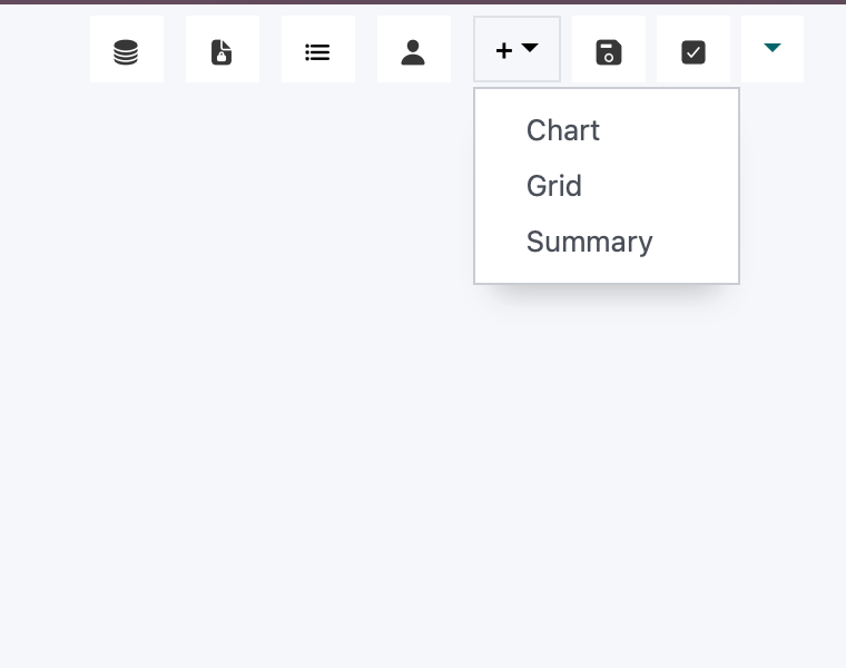
When you click on the Add Widget button this will open a dropdown with the widgets
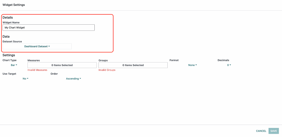
When you click on a widget this is what you will see:
The section highlighted in red is standard for all widgets and the rest varies between widgets.
Also you have the Save and Cancel buttons at the bottom. The Save button is disabled until all the fields have a valid input. Once you press Save that either Creates a new Widget or it updates an existing one.
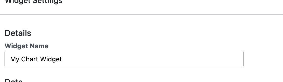
At the top is the Widget Name which will be displayed at the top of the widget when the widget is created.
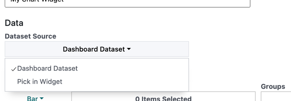
Then you have the Dataset Source which is used to select where the widget data will come from. It can come from the dataset you selected on the dashboard + the filtration you selected on the dashboard which is set by default + caching settings on the dashboard.
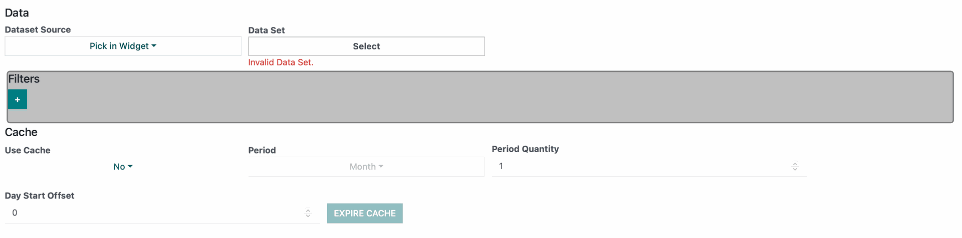
Or you can select the option Pick in Widget which completely overrides the selected dataset, filtration and caching settings in the dashboard and pick them on this widget only.
Chart Widget
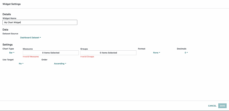
When we select the Chart Widget we have the standard fields for every widget and in the Settings section we have the following options.
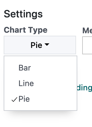
Chart Type:
has three different types of charts
Chart Type has three different types of charts
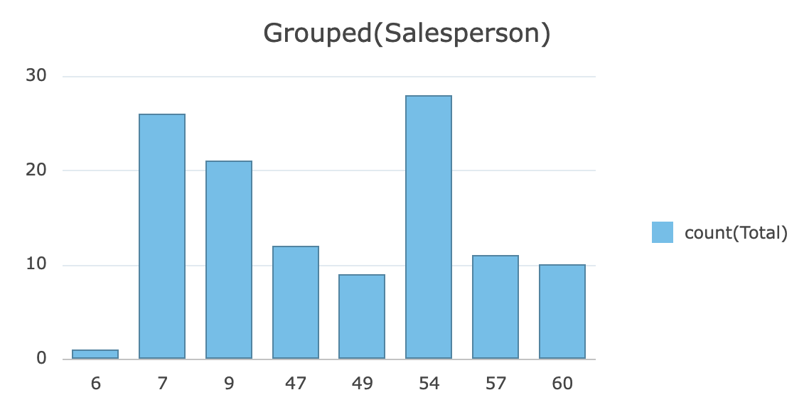
Bar Chart
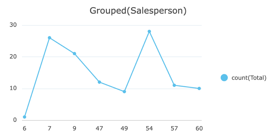
Line Chart
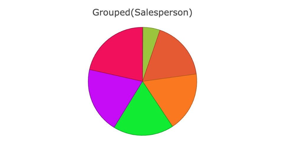
Pie Chart
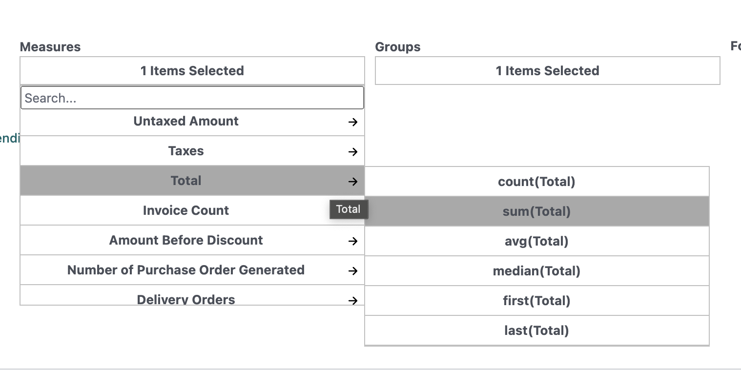
Measures:
The measures are fields from the dataset you selected. You can select only one measure for the Pie Chart and Line Chart and as many as you need on Bar Chart. The measures are the aggregated numbers based grouping used. You have the following aggregates:
count - this represents the number of rows in a select grouping.
sum - the total sum of the values in a selected grouping.
avg - the average amount of the values in a selected grouping.
median - the median value of the values in the selected grouping ordered by the Order option below.
first - the first value of the selected grouping based on the Order option below.
last - the last value of the selected grouping based on the Order option below.
Then we have Groups.
Groups are fields from the dataset.
You can group by as many groups as you need.
Groups are used for separating rows into different pools of rows that have something in common and in this case its the value of the selected field. Lets say we have a salesperson and that salesperson has many sales orders. so if we group by salesperson each pool will have the salespersons sales orders and when we combine this with the measures we get the aggregated results from the measures.
When grouping there is a grouping hirearchy. the hirerarchy is determined by the order of selection of groups in the dropdown.
Grouping by dates:
When we group by dates we group by a certain period. Lets say we select Day.
If we group by Day this will group by all the dates that are set in the space of each day. So again just like with the salesperson the rows will be grouped based on days.
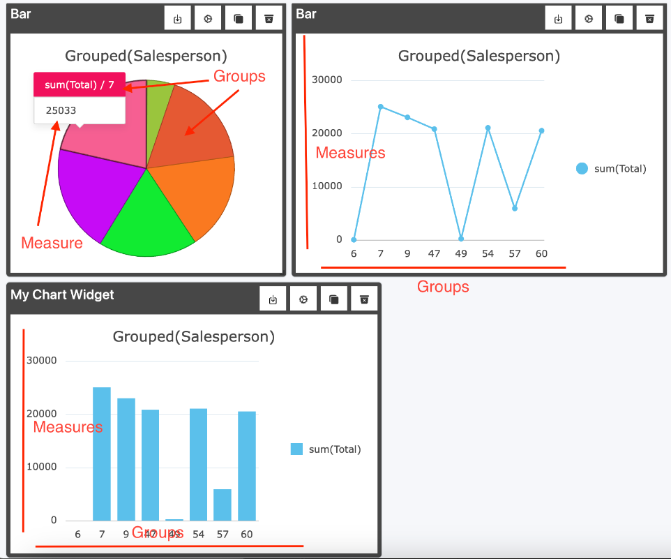
Example:
One Measure and One Group
Group - Salesperson - Number
Measure - Sum(Total)
Example:
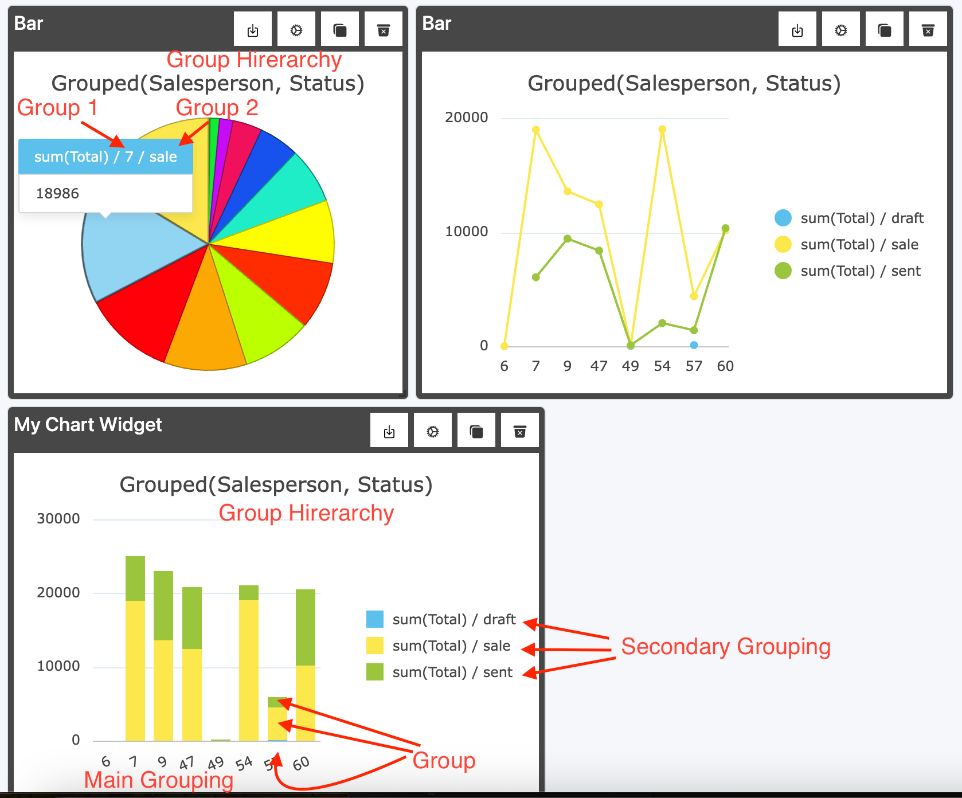
One Measure and Two Groups
Group - Salesperson - Number, Status - Text
Measure - Sum(Total)
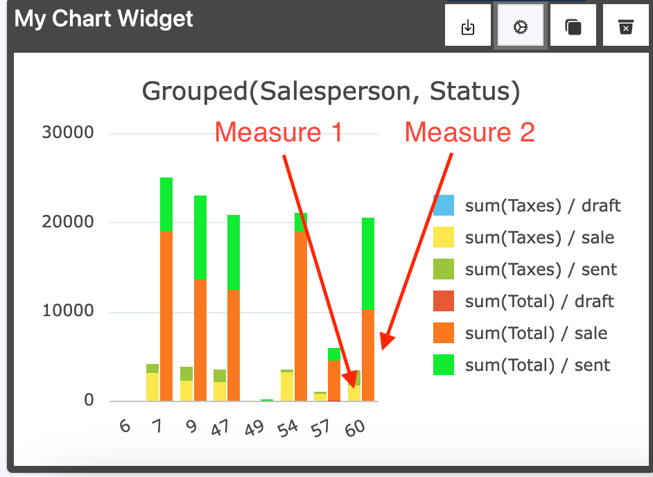
Example:
Two Measures and Two Groups
Group - Salesperson - Number, Status - Text
Measure - Sum(Total), Sum(Taxes)
Multiple measures are only available on Bar Chart Type
Notice that now each group has 2 columns representing each measure.
So the more measures you have the more columns you have.
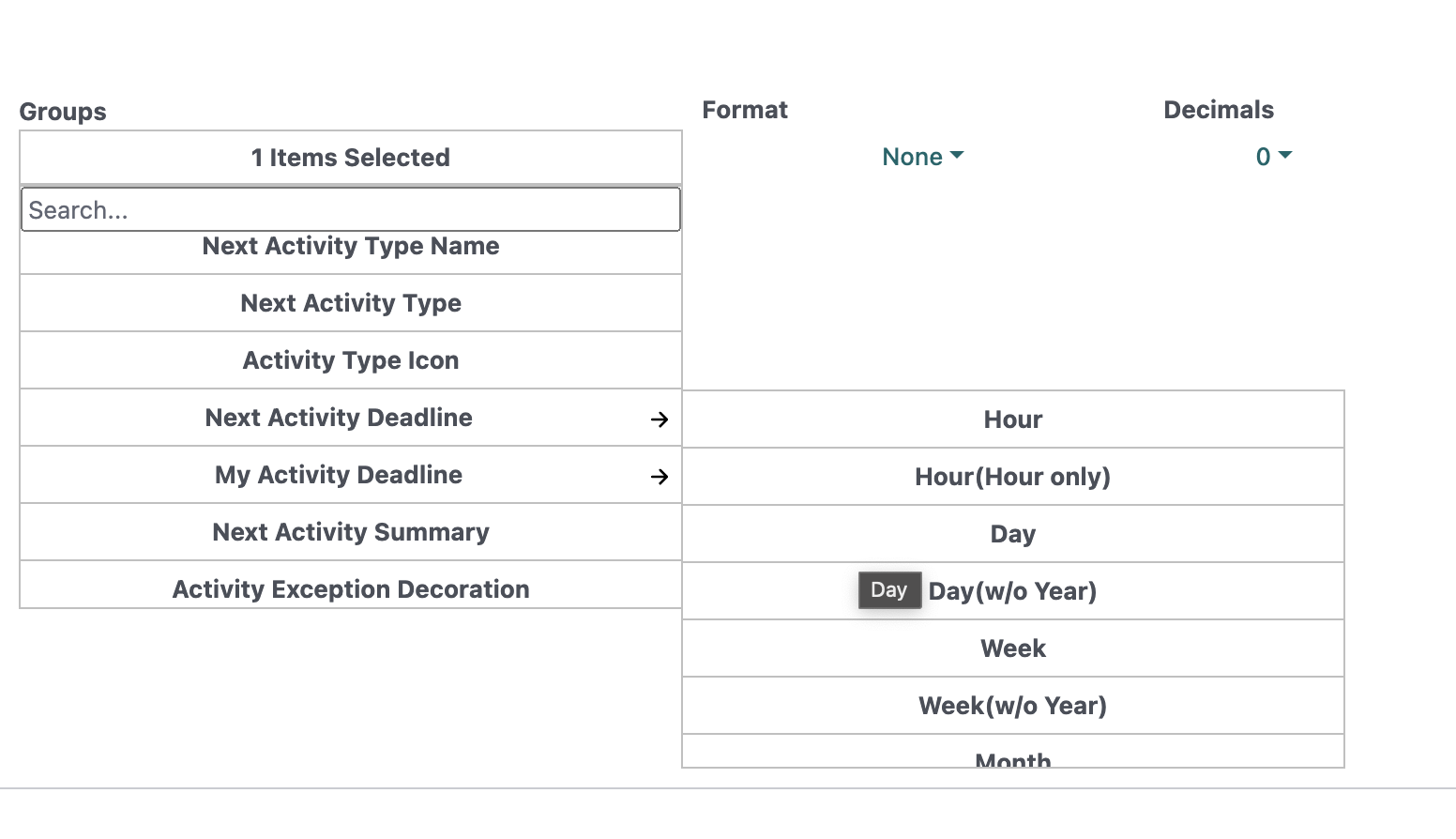
Date Groups:
Full - Groups the date without any period grouping.
Hour - Groups by hour for each day, month and year.
Hour(Hour only) - Groups by hour regardless of the day, month and year.
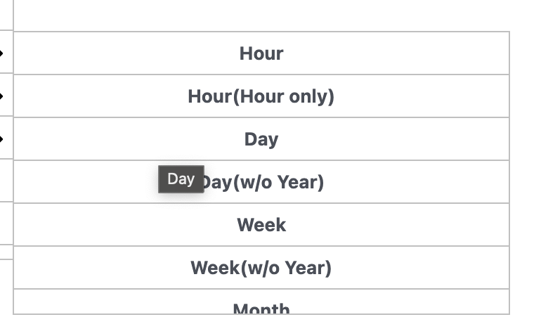
Day - Groups data by day month and year.
Day(w/o Year) Groups data by day and month regardless of year.
Week - Groups by week number and year.
Week(w/o Year) - Groups by week number regardless of year.
Month - Groups by month and year
Month(w/o Year) - Groups by month regardless of year.
Quarter - Groups by quarter and year.
Quarter(w/o Year) - Groups by quarter regardless of year.
Year - Groups by year.
Example:
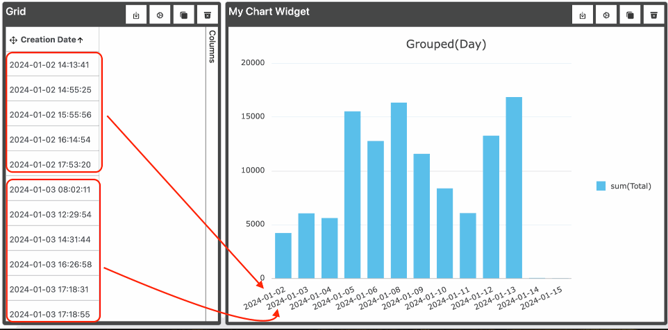
1 Date Group and 1 Measure
Group - Create Date(Day) - (Date)
Measure - Sum(Total)
In the example all these days are made into a group. The same happens for every period as described in Date Groups Section.
Example:
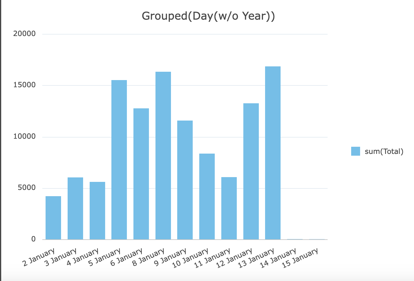
1 Date Group and 1 Measure
Group - Create Date(Day(w/o Year)) - (Date)
Measure - Sum(Total)
In this example we can see that the year is excluded from the period so if there is any data from different years it would be aggregated as a single year this way.
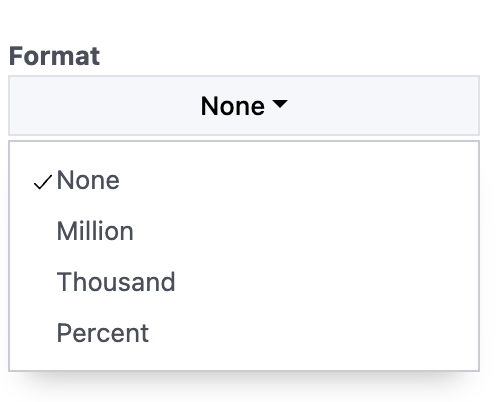
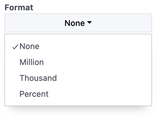
Format:
This option controls the Measure format of the chart.
For instance if we have the number 3 000 000
None - will display 3 000 000
Million - will display 3M
Thousand - will display 3000K
Percent - This only appends % at the back so it would be 3 000 000%
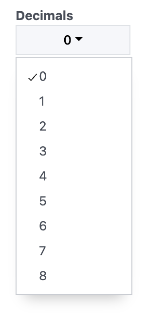
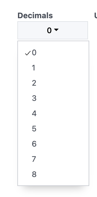
Decimals:
This option controls the amount of decimals the measures have.
For instance if we have the number 3 400.4
0 - will display 3 400
1 - will display 3 400.4
2 - will display 3 400.40
and so on...
Also if you apply formatting it still works as intended.
Lets say you select 1 decimal and format to thousands. The result will be 3.4K
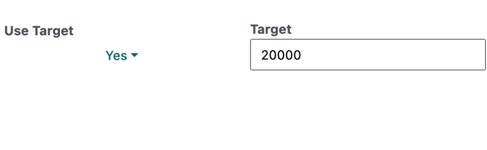
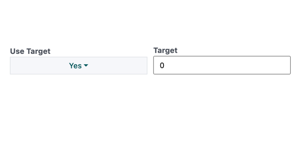
Use Target:
This option is used for setting a target on the chart.
By default the Use Target is set to No but if you turn it on an additional Target field appears where you can enter a number.
Target can be set for Both Bar and Line Chart Types.
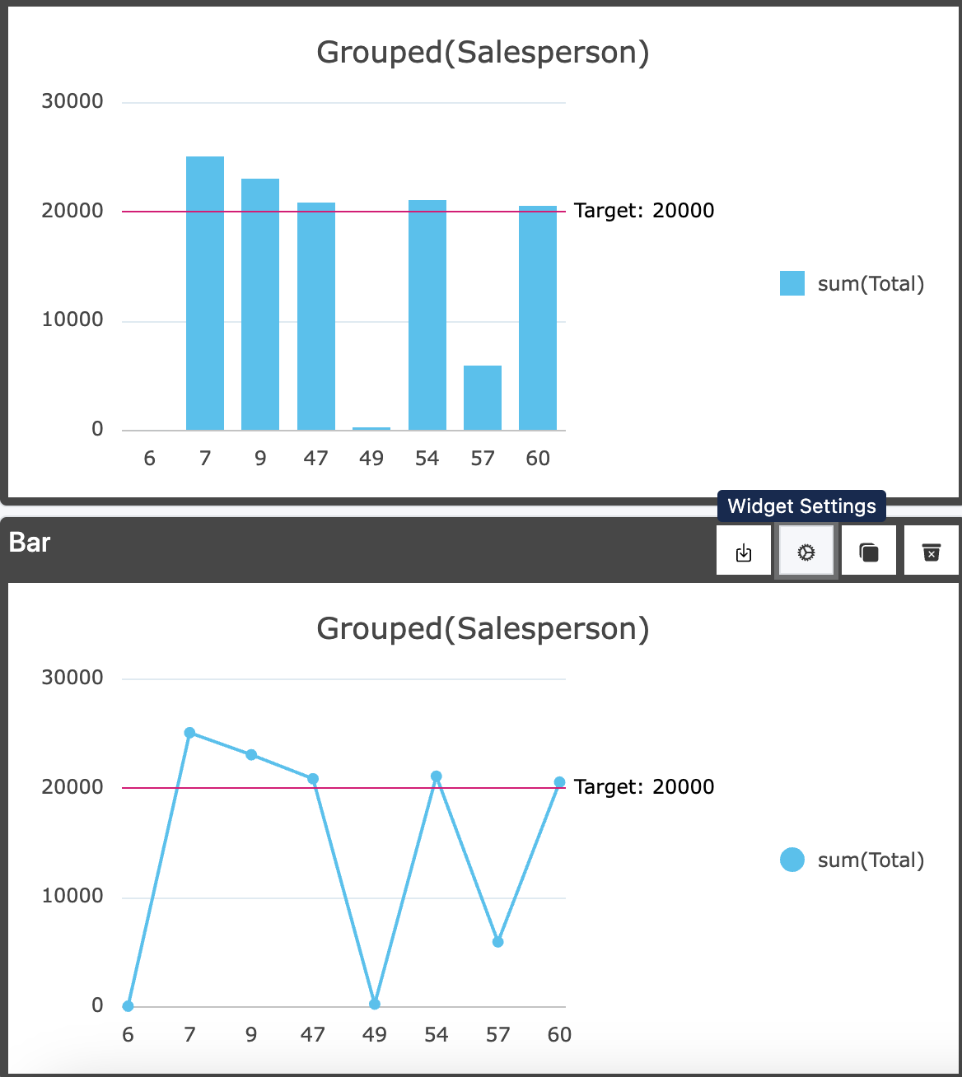
Example:
If we set Use Target to Yes and Target to 20000.
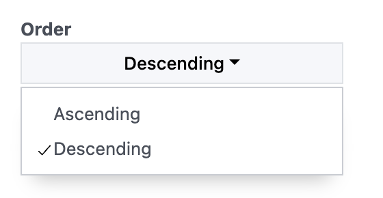
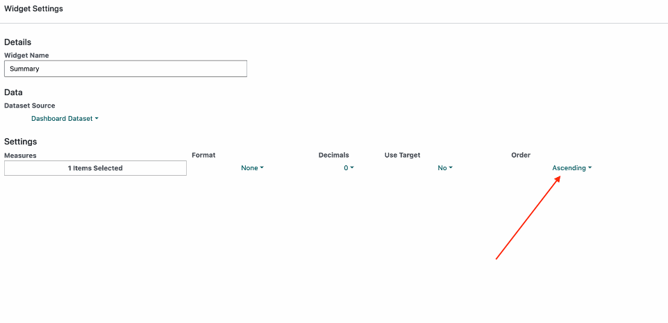
Order:
This option controls the Order of the Measures and also Median, Last and First Measure selection as it changes the order of the data.
Example:
In the image you can see the top examples are ordered by Ascending order and the bottom by Descending order.
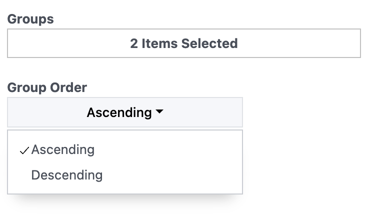
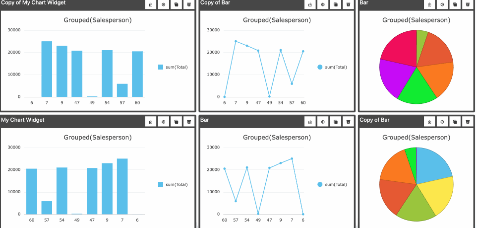
Group Order:
This field is only visible when we have more than one group selected. I allows us to control the direction of the groups.
Example:
Top is in ascending Group Order
Bottom is in descending Group Order
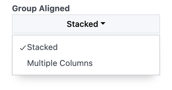
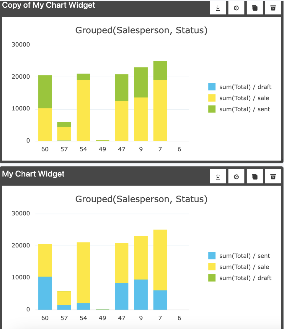
Group Aligned:
This column is visible when we have multiple Groups selected and 1 Measure selected ONLY on the Bar Chart.
It causes the stacked groupes to be made into columns
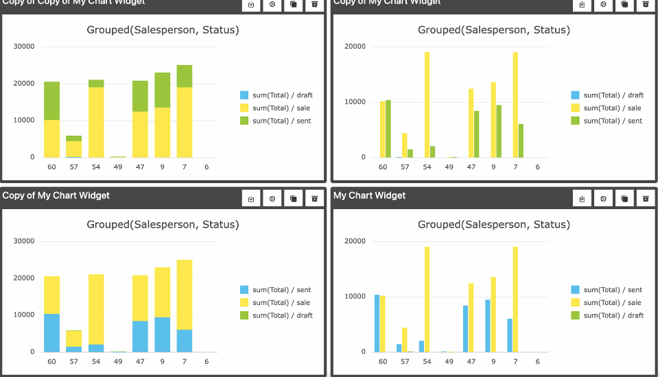
Example:
Top Left is in ascending Group Order and Group Aligned is Set to Stacked.
Bottom Left is in descending Group Order and Group Aligned is Set to Stacked.
Top Right is in ascending Group Order and Group Aligned is Set to Multiple Columns.
Bottom Right is in descending Group Order and Group Aligned is Set to Multiple Columns.
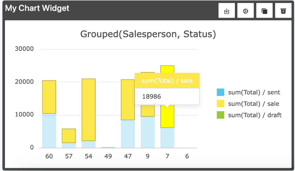
Redirect:
When you hover over a column and double click on it you will be redirected to the Odoo Records.
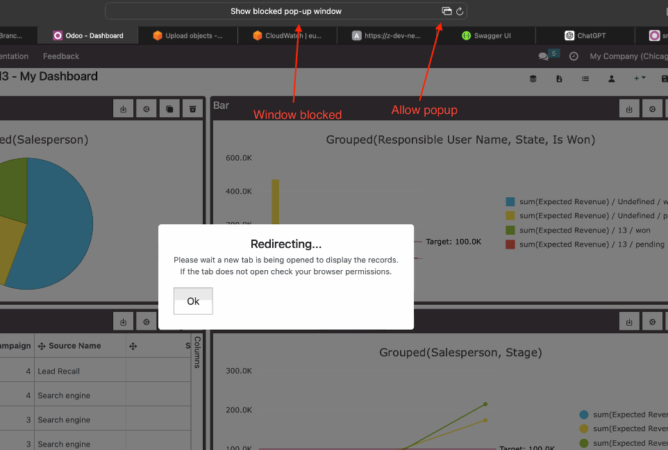
Redirect:
The redirect will be open in another tab but you may encounter the browser blocking the opening of a new tab and you need to allow it to see the results.
Redirect 2:
This is where the redirect will take you to.
Customer names and Salespeople are blanked out.
Grid Widget
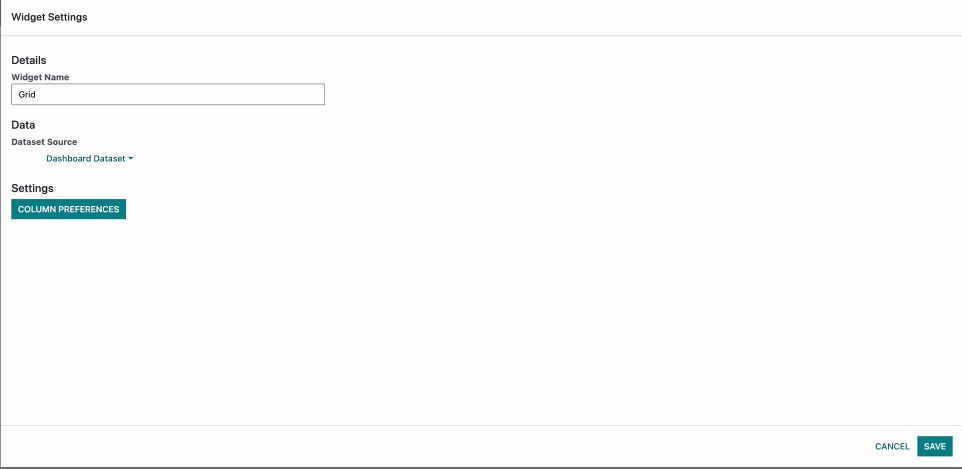
When we open the Grid Widget Settings this is what we see. We have the default options Widget Name and Dataset Source. Then we have the Column Preferences
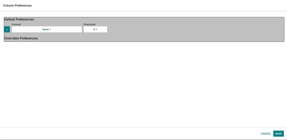
When we open the Column Preferences we see the Default Preferences which are Format and Precision.
The Default Preferences are used to determine the default format and precision for the grid.
By default Format is None and Precision is 0
There is also a + Button for adding Overridden Preferences
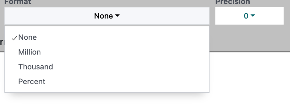
Format:
This option controls the Measure format of the grid.
For instance if we have the number 3 000 000
None - will display 3 000 000
Million - will display 3M
Thousand - will display 3000K
Percent - This only appends % at the back so it would be 3 000 000%
Decimals:
This option controls the amount of decimals the measures have.
For instance if we have the number 3 400.4
0 - will display 3 400
1 - will display 3 400.4
2 - will display 3 400.40
and so on...
Also if you apply formatting it still works as intended.
Lets say you select 1 decimal and format to thousands. The result will be 3.4K
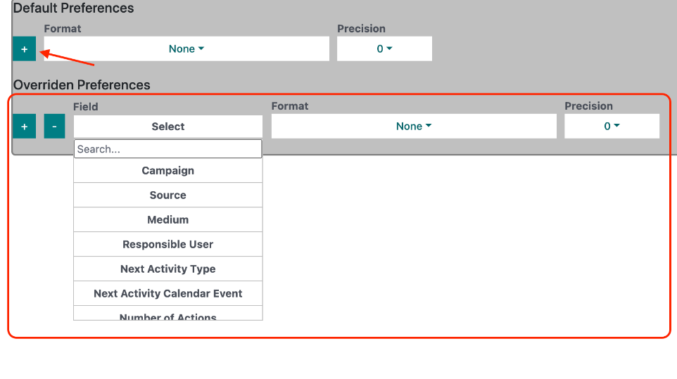
When we click on the + Button it adds an Overridden Preference. This preference is only for a specific column on the Grid. You can add as many Overridden Preferences as you need.
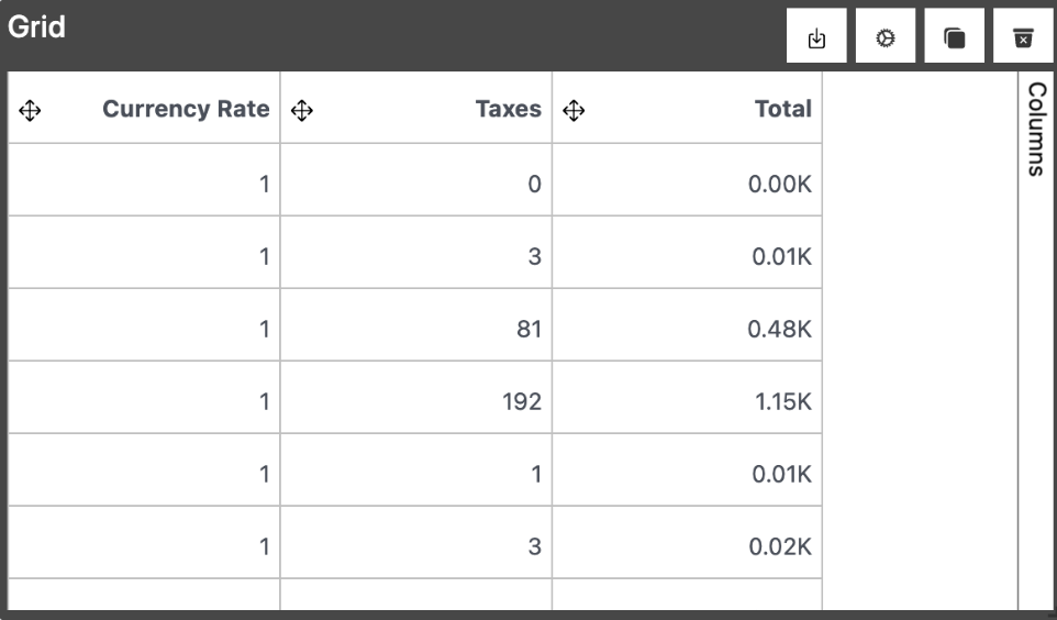
Example:
So lets assume that the Total column has an Overridden Preference as follows:
Format: Thousand
Precision: 2
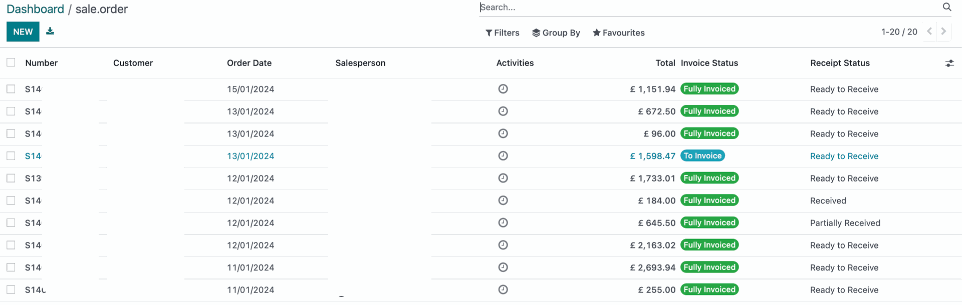
On the image you can see how Total has the format and decimal places applied while Currency Rate and Taxes use the Default Preferences.
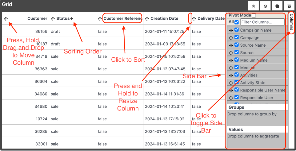
Once we have the Grid Widget Created the widget its self is more interactive than the other widgets.
You are able to Multi Column Sort, Drag and Drop Columns, Hide Columns, Resize Columns, Group By, Pivot
Directly inside the grid window of the widget.
Please take a look at the image for more details.
Multi Sorting is enabled by holding down the Shift Key.
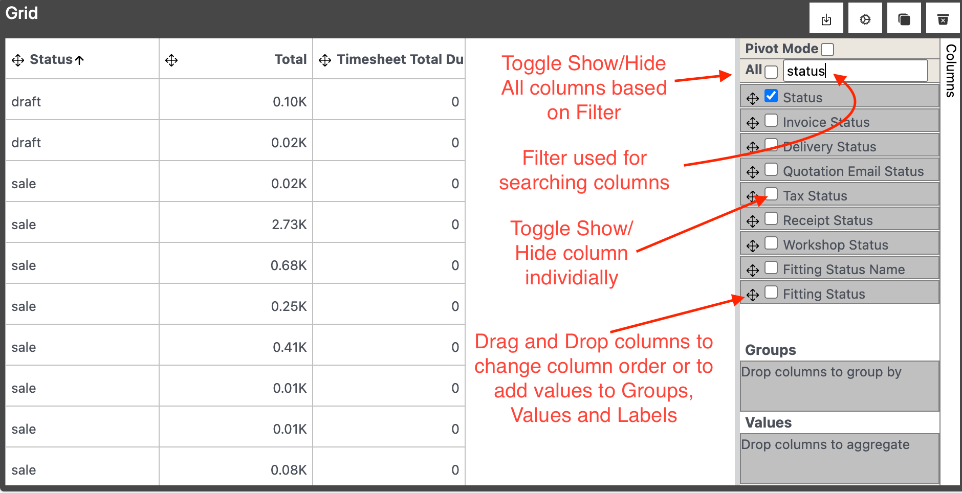
Here is a more in depth look into the Side Bar.
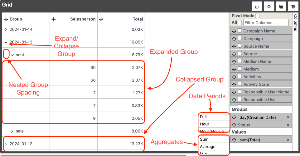
Grouping:
When we drag a column into Groups the data becomes aggregated into a pool. We can Group by as many Groups as we want. The Grouping order is determined from top to bottom order of the columns inside the Groups section. Dates inside Groups also have Date periods available when you click on top of the column name inside Groups. The default value is day. Notice also that both the Group columns are not selected as visible. This is because we don't need them in this case but they can also be made visible on their own and can also be added to values at the same time.
Date Periods:
Full - Groups the date without any period grouping.
Hour - Groups by hour for each day, month and year.
Hour(Hour only) - Groups by hour regardless of the day, month and year.
Day - Groups data by day month and year.
Day(w/o Year) Groups data by day and month regardless of year.
Week - Groups by week number and year.
Week(w/o Year) - Groups by week number regardless of year.
Month - Groups by month and year
Month(w/o Year) - Groups by month regardless of year.
Quarter - Groups by quarter and year.
Quarter(w/o Year) - Groups by quarter regardless of year.
Year - Groups by year.
Values are the aggregated values for each group. They are calculated on each grouping level when selected. The aggregates are selected by clicking on the Column name inside the Values section. The default value is count. You can add as many value columns as needed.
Aggregates:
count - this represents the number of rows in a select grouping.
sum - the total sum of the values in a selected grouping.
avg - the average amount of the values in a selected grouping.
median - the median value of the values in the selected grouping ordered by the Order option below.
first - the first value of the selected grouping based on the Order option below.
last - the last value of the selected grouping based on the Order option below.
Every Group can be expanded and collapsed.
When we have more than one Grouping like in the image here we can expand/collapse nested groups as well.
Notice also how the Salesperson Column rows have data when the Groups are expanded but when they are collapsed it does not. This is because its not added inside the Values section. You can also notice that Total Column rows have data both when expanded and collapsed and this is because it is added to the Values
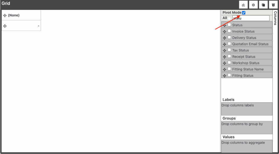
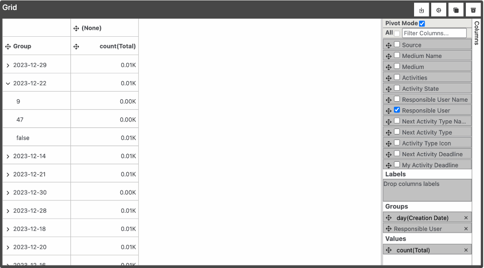
Pivot Mode:
When you click the Pivot Mode Checkbox shown with the small arrow the grid will change. The things that you will notice are:
Labels will appear above groups.
If you dont have any Groups or Values selected before enabling Pivot Mode you will only see 2 Headers (None) and an empty header just like in the image
When you click a column to be shown on the grid it will appear inside Groups.
When you hide a column from the grid it will be removed whereever its visible either in Labels, Groups or Values
Only the columns inside either Labels, Groups and Values are visible
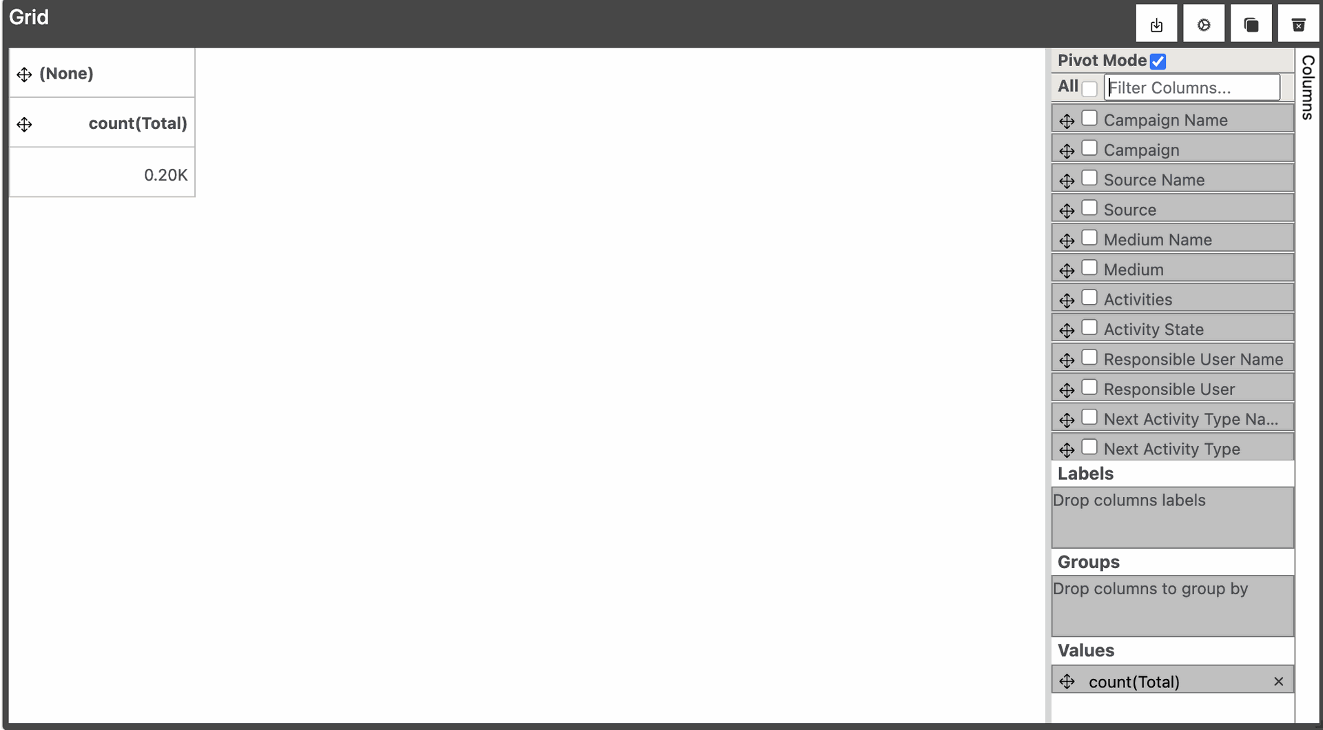
Exmaple:
Adding 1 column to Values
When you add 1 single column to Values what you will notice is that the Empty column is now count(Total) and below it you will see the total count which still have the formatting applied so its displaying 200 as 0.20K. This all the rows aggregated into one since we haven't selected any Groups.
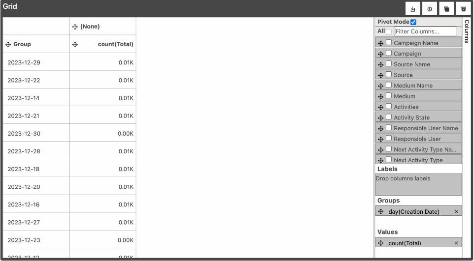
Exmaple:
Adding 1 column to Values and 1 Column to Groups
So for the most part Groups work the same as when Pivot mode is disabled except that when you have one column inside Groups you cannot expand/collapse.
Exmaple:
Adding 1 column to Values and 2 Column to Groups
When we add a second then we are able to expand/collapse and the more Groups we add the more we will be able to drill down.
Exmaple:
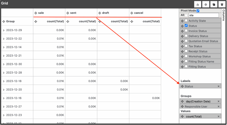
Adding 1 column to Values and 2 Column to Groups and 1 Column to Labels
If you take a look at the image you can see that Labels acts as a horizontal Grouping.
It works just like the Grouping does.
Exmaple:
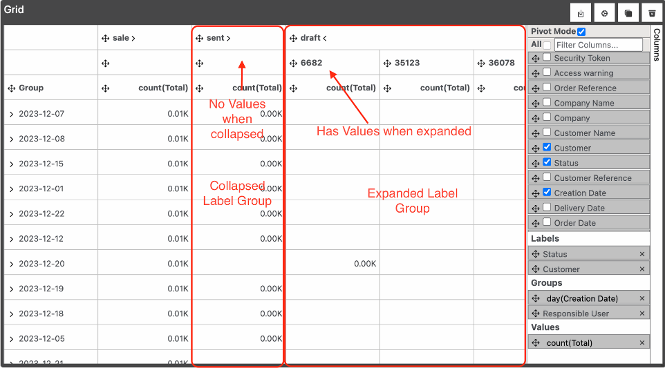
Adding 1 column to Values and 2 Column to Groups and 2 Column to Labels
When we add a second Label we are then able to expand and collapse the Header Labels just like the Groups.
The difference is we can also drag and drop the Groups.
Exmaple:
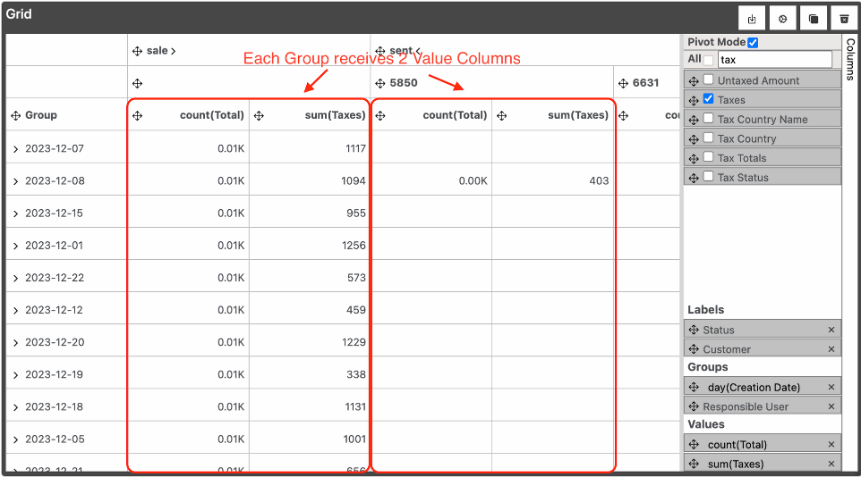
Adding 2 column to Values and 2 Column to Groups and 2 Column to Labels
Now when we add another column to Values there is something that you should take notice. we have another column added to each Label Group no matter if its expanded or collapsed.
Redirection:
When we double click on a row it takes us to the Odoo records for the given rows in a new tab.
The browser may block the new tab so you may have to enable it.
Pivot Mode Disabled:
No matter where you double click on the row all records within that row will be opened(if grouped)
Pivot Mode Enabled:
When we have Pivot mode enabled and we have labels added the rows are filtered by the Label Group clicked on as well.
Redirection:
In the new window you should see the records according to your click.
Summary Widget
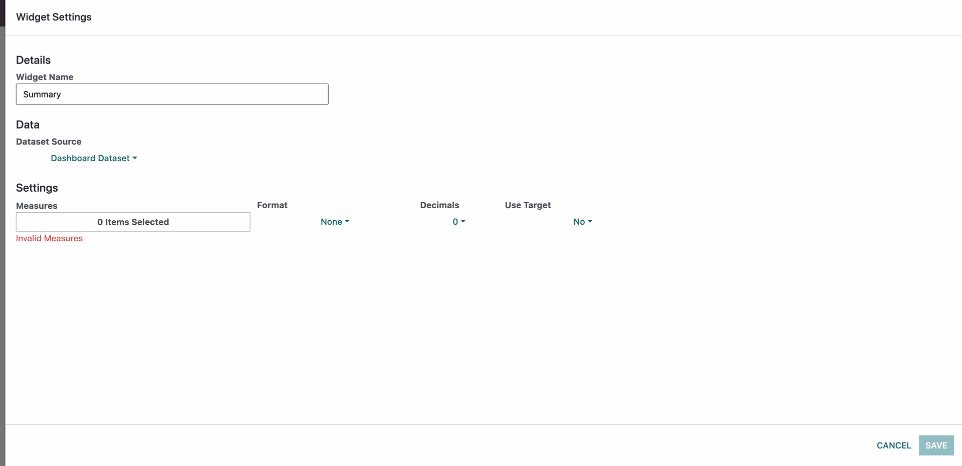
When we open the Summary Widget Settings this is what we see. We have the default options Widget Name and Dataset Source. Measures, Format, Decimals and Use Target.
Measures is used to pick the field from the dataset that is going to be displayed.This aggregates all of the available data. The aggregation options are:
count - total number of rows
sum - total summed value of the values inside each row for the selected field.
avg - the average value of the values inside all of the data for every row for the selected field.
median - the middle row of all of the rows of data for the selected field based on the order.(When this is seelcted it enables the order option to control exactly which value is selected)
first - the first row of all of the rows of data for the selected field based on the order.(When this is seelcted it enables the order option to control exactly which value is selected)
last - the last row of all of the rows of data for the selected field based on the order.(When this is seelcted it enables the order option to control exactly which value is selected)
When we select either a Median, First or Last measure aggregate we have the order appear at the end which controls the data order.
It has only Ascending and Descending options.
Format:
This option controls the final value format of the summary widget.
For instance if we have the value 3 000 000
None - will display 3 000 000
Million - will display 3M
Thousand - will display 3000K
Percent - This only appends % at the back so it would be 3 000 000%
Decimals:
This option controls the amount of decimals the final value has.
For instance if we have the number 3 400.4
0 - will display 3 400
1 - will display 3 400.4
2 - will display 3 400.40
and so on...
Also if you apply formatting it still works as intended.
Lets say you select 1 decimal and format to thousands. The result will be 3.4K
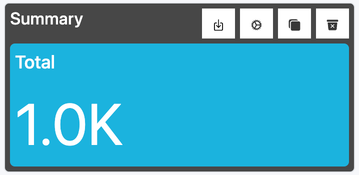
Example:
We selected Measure avg(Total), Format Thousand, 1 Decimal and Use Target No.
Only when the Use Target is No we have the blue color summary.
Use Target:
If we select Use Target Yes we enable the Target option which allows us to input a value which is a target.
If the value is equal of above the target the background is Green.
If the value is below the target the background is Red.
Here are all 3 examples of Use Target.
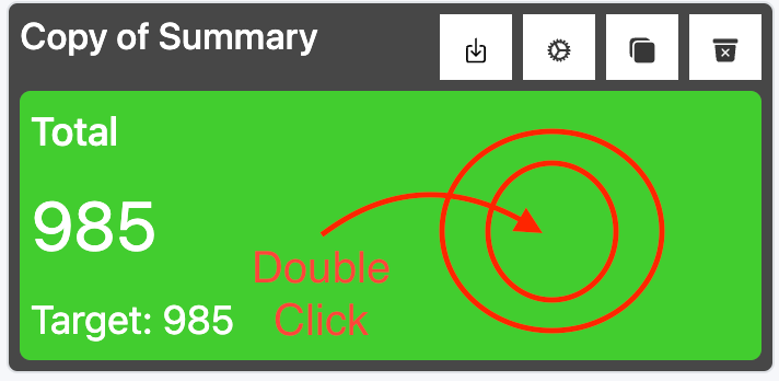
Redirect:
If we double click on the Summary we will be redirected to all of the Odoo records used to achieve the total.
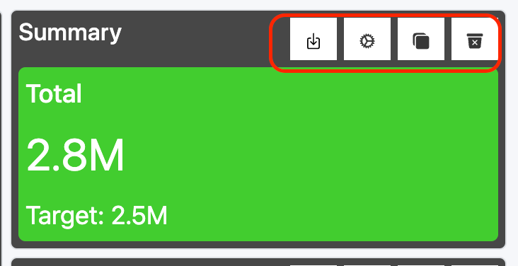
Widget Controls
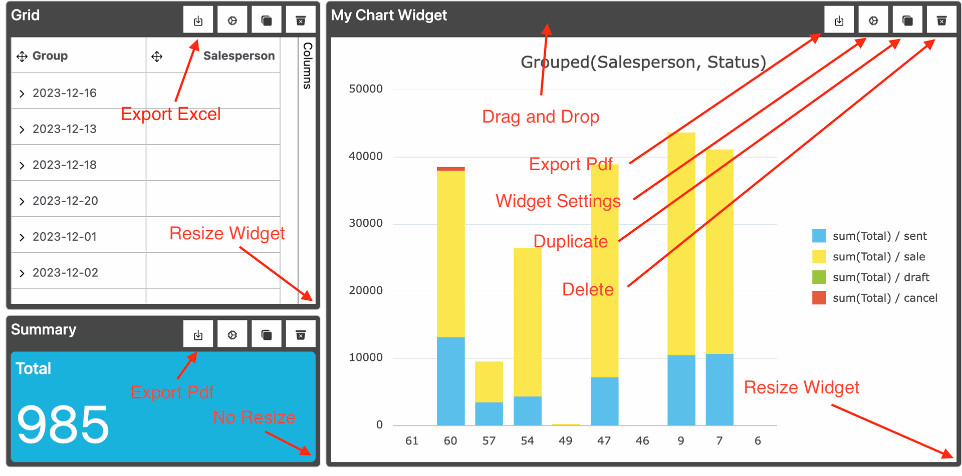
Take a look at the image and you will see the main functionalities with small differences.
The key differences are:
Summary widgets cannot resize
The Grid Widget exports Excel while Chart and Summary export Pdf
Custom Datasets
Custom Dataset List
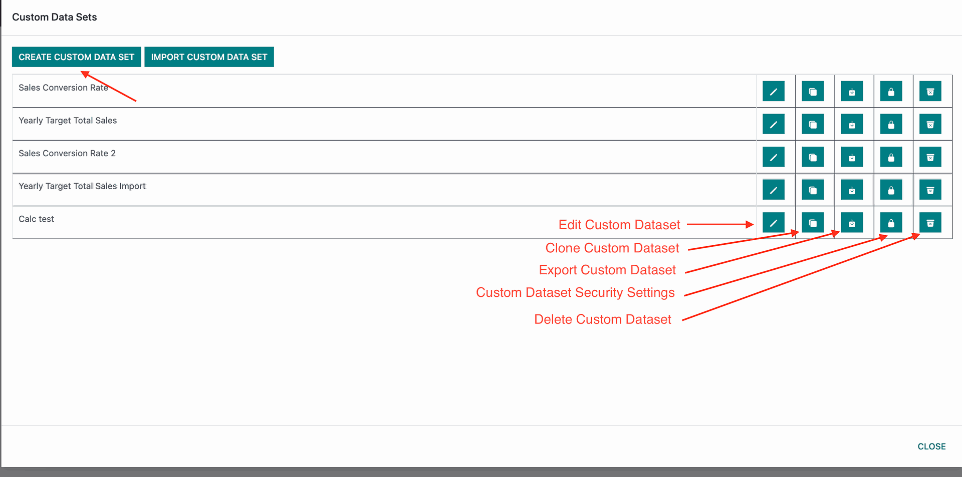
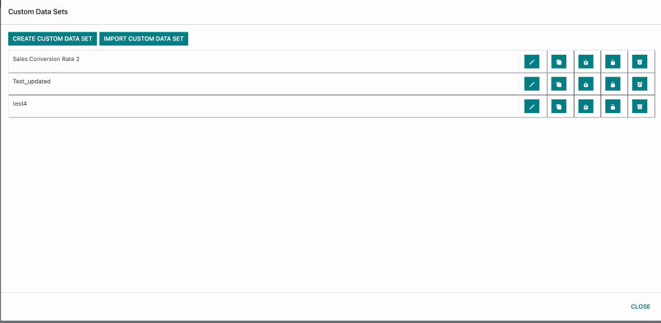
When open the Custom Datasets List this is what we see.
Edit, Clone, Import and Create Custom Dataset all open the same modal.
When we export the custom dataset and attempt to import it at a different instance there could be some differences in the tables and columns available on the other environemnt. This is why import allows you to edit the imported data before importing.
The Security Settings button brings up a different modal that allows you to control access rights and apply additional filtering on a group per group level.
Now lets click on Create Custom Dataset
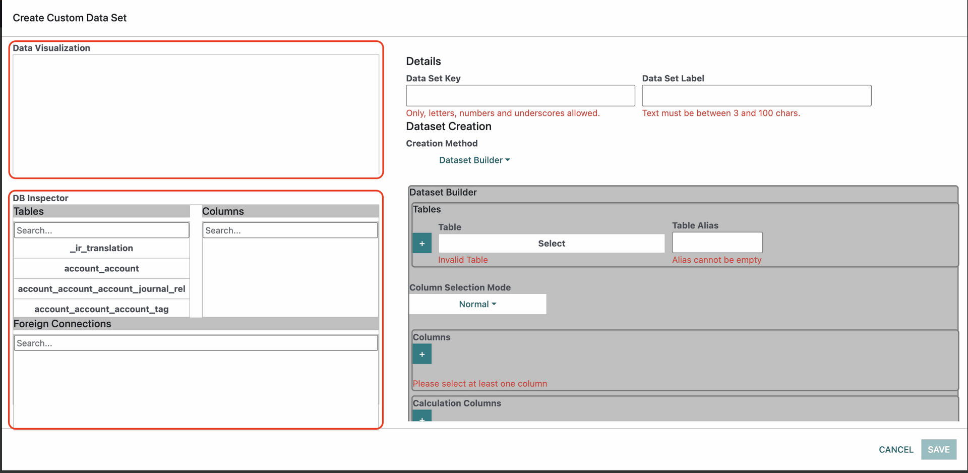
When we open the Create Custom Dataset Modal here is what we see:
We have the Data Visualisation and DB Inspector to the left and Details, Dataset Creation and Dataset Builder to the right.
The right side is scrollable so there are a bit more details there but lets first cover the left side.
Data Visualisation is a Grid that dynamically updates to show you how your data currently looks. It loads a limited number of rows for performance purposes so what you see there is not the full dataset but you can still get an idea how your data looks.
The DB Inspector is used to analyze your Odoo database. This is useful for when building the datasets it may help you find the type of a column you are looking for or if you just want to look at the tables foreign connections.
We will see how to use both in the examples below.
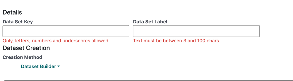
First lets explain the details section.
We have a Data Set Key. This key acts as a unique identifier for the dataset. The name must be unique and it only allows lowercase letters, numbers and underscores in it. The validation will let you know if its unique or not.
The Data Set Label is what you will see shown when selecting a Dataset on a Dashboard or Widget level. The label does not have any restrictions on what it can be its only limited to a 100 charachters.
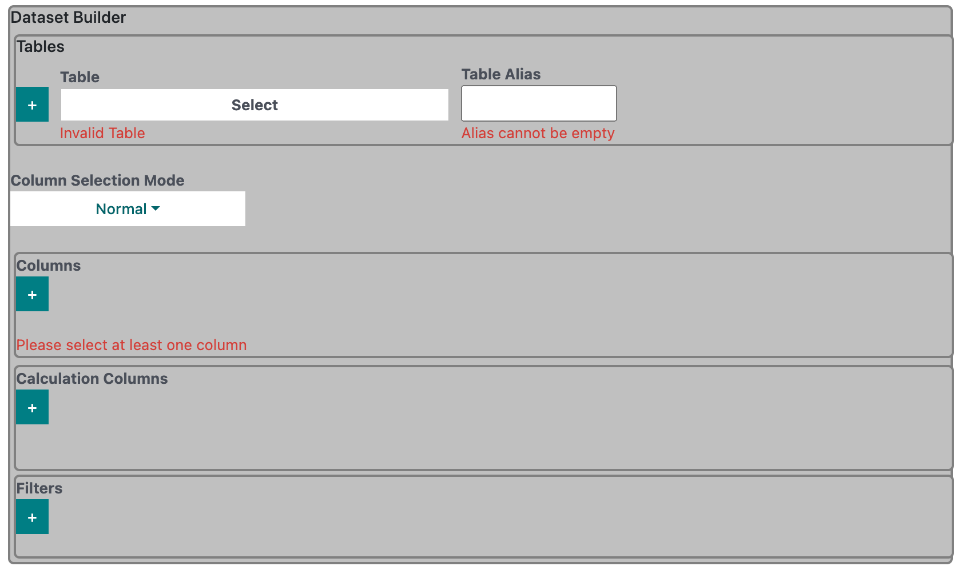
Here is how the whole Dataset Builder looks lets break it down.
Tables Section - allows us to select a table we want to get data from for our new Custom Dataset and also join that table with additional tables to create a more complex dataset.
Column Selection Mode - This is for selecting how we want to add columns to the dataset. There are 2 options:
Normal - this is default and it allows us to take columns flat.
Group By - this option allows us to Group By and Aggregate data based on aggregates.
We will cover both cases in Examples.
Columns Section - This option is for selecting which columns we want to add to out Custom Dataset. This section is only available when Column Selection Mode is Normal. If we use Column Selection Mode Group By the section would be replaced by a Group By Columns Section and a Values Section instead.
Calculation Columns Section - This Section i used once we add columns to the sections listed above Columns, Group By Columns and Values. This section is used for creating dynamic columns based on calculations from existing columns.
Filters - This section allows us to filter the data that will be available in the dataset.

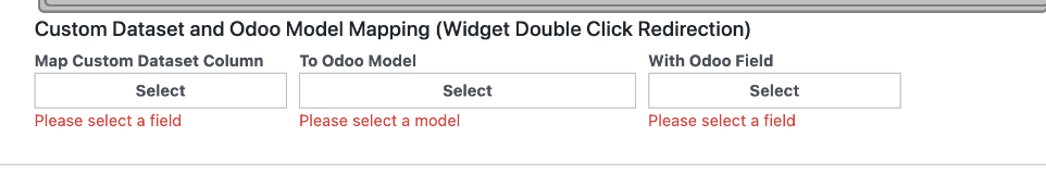
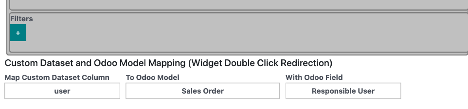
Right below the Dataset Builder we have the final part of this modal which is used for mapping the Custom Dataset to an Odoo Model and field so that when we double click on our custom dataset we are redirected correctly to a list of Odoo records.
Map Custom Dataset Column - this is a column that we added to Columns, Group By or Values section in our custom dataset.
To Odoo Model - lets us select from all the Odoo models.
With Odoo Field - this is all of the fields from the Odoo Model you selected. This field in Odoo should be equivalent to the field we selected from the Map Custom Dataset Column.
The first thing we will look at is the Tables.
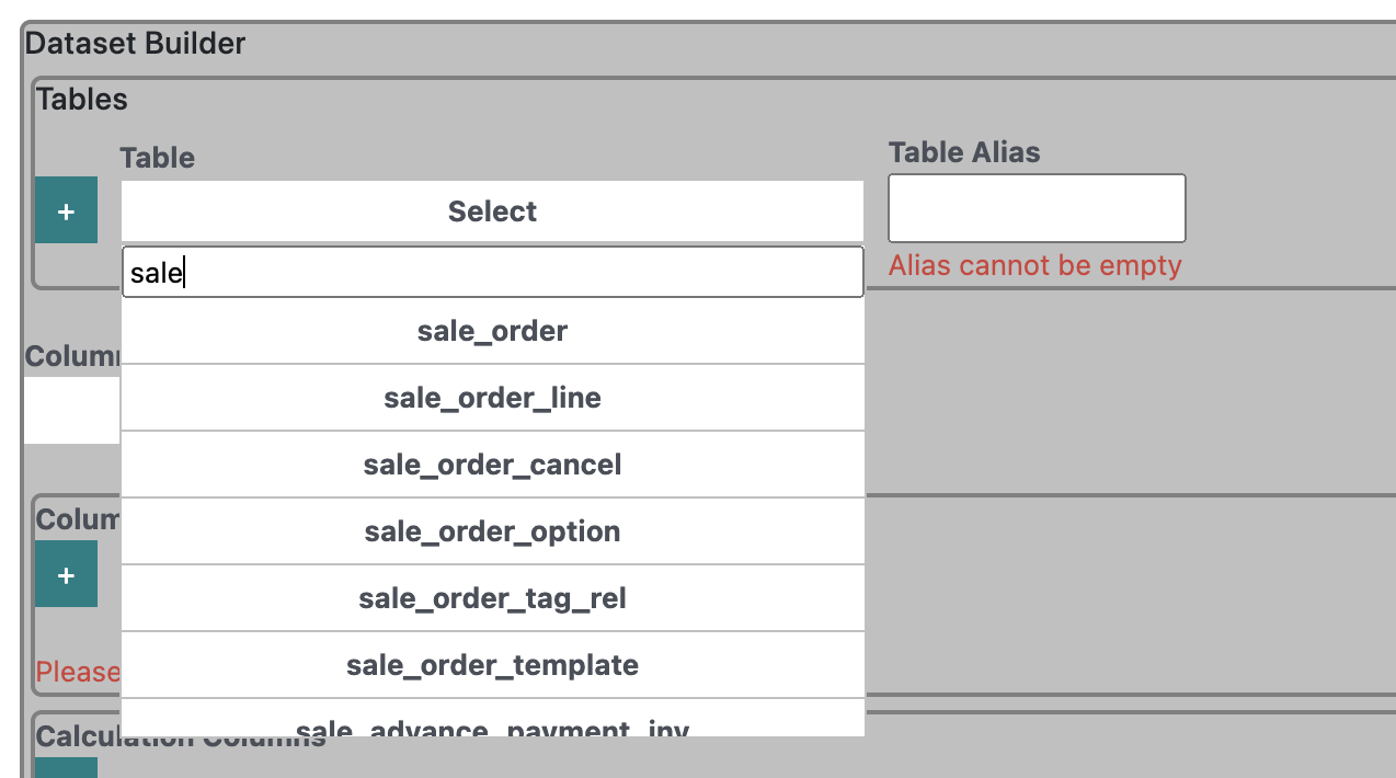
Lets select one like 'sale_order' and we will give the table a Table Alias such as 'so'.
The table alias only allows lowercase letters, numbers and underscore. under those circumstances we can set to anything we want. Preferred convention is an abbreviation of the table name if possible for simplicity.
Table Aliases are mandatory and they are needed because this was we can Identify the column we need more accurately. Because for instance all tables in odoo have an 'id' column the alias allows us to get the correct id that we want.
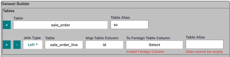
In this example we added another table. So what options do we have?
Join Type - By default Join type is set to Left. In most cases left join will be a great option but if you want to learn more about joins you can read here: https://www.numpyninja.com/post/understanding-joins-in-postgresql
Table - this is the table we want to add.
Map Table Column - this is a column from the new table we selected. In this case its from 'sale_order_line'. We will use it to join with another table and in this case with 'sale_order'.
Now lets try and use the DB Inspector to find out how we can join them.
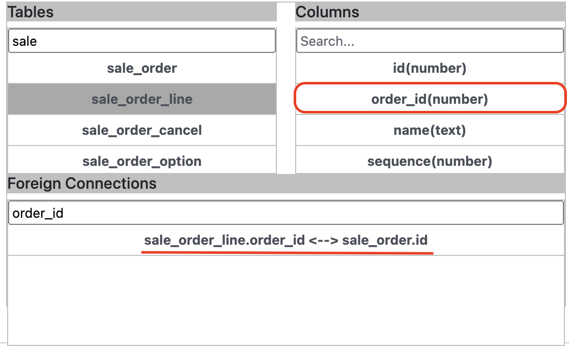
Here is an example how we can find the connection.
first we can look into 'sale_order' and we don't seem to find anything in the Columns section resembling a 'sale_order_line' foreign column.
Then we try and search the 'sale_order_line' table and at the top we can notice an 'order_id' column inside the Columns section.
Then to verify that this is the correct column we can search for it in the Foreign Connections section and in this case we find that it is.
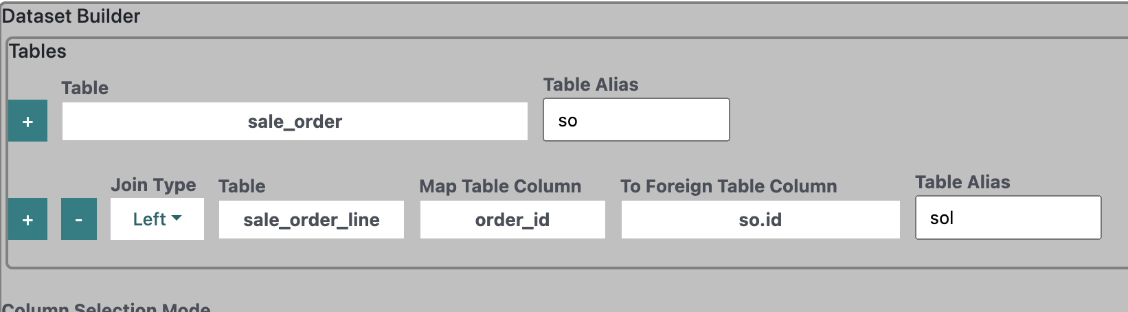
After we have discovered that the column is 'order_id' and is located in the 'sale_order_line' table we select it in Map Table Column since this option corresponds to the 'sale_order_line' columns.
After that we can set the To Foreign Table Column. In the Db Inspector we saw in the Foreign Connections section that 'order_id' is foreign key to the 'id' column in 'sale_order'.
When you open the dropdown you will see that all columns are displayed in the following format:
[Table Alias].[Column Name]
So in this case since 'sale_order' alias is 'so' we need to select 'so.id'.
After that we just need to set the Table alias which in this case is set to sol.
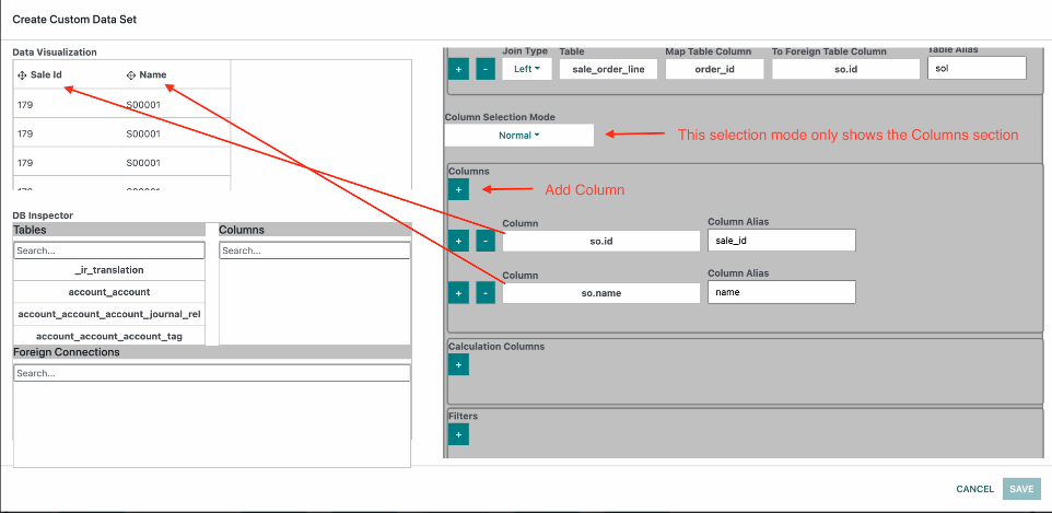
Now let's take a look at the column selection.
For this example we will have Column Selection Mode Normal so we will be selecting from the Columns section.
When we add a column we create a new row that has 2 options Column and Column Alias.
The format for the Column section is the same with the tables [Table Alias].[ColumnName]. So we just select the columns we need.
The Column Alias acts as a key identifier of the new column. It only allows lowercase letters, numbers and underscores. Notice how in the Data Visualisation section the Column Aliases appear with Capital letters and spaces. This is because the names are auto generated from the aliases.
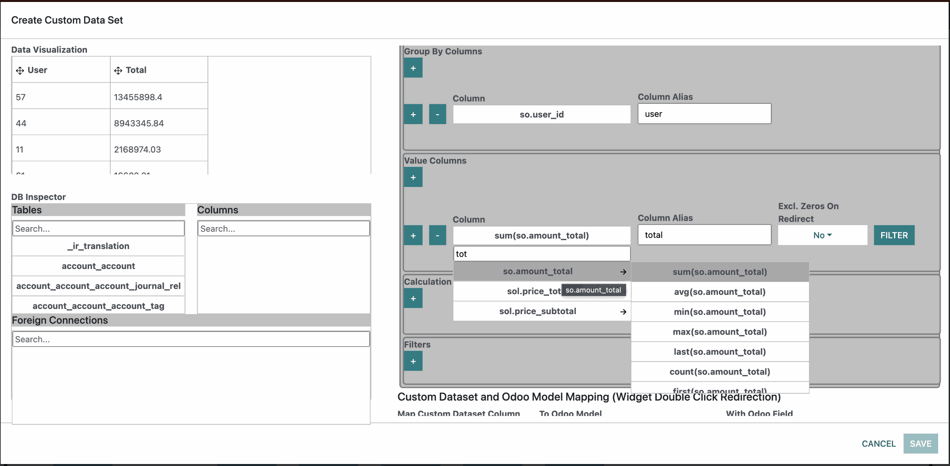
When we change the Column Selection Mode to Group By our Columns dissapear and the Column section dissapears and in its place Group By Columns and Value Columns sections appear. Group By Columns looks the same with a small difference. In its dropdown the dates have grouping options where we aggregate groups (full, day, week, month, quarter, year). As an example if we have the following dates 02/05/2023, 05/05/2023, 15/05/2023 and we select the month aggregate we will receive a new date which will be 01/05/2023. So the first day of the aggregated month and this will become one group.
For the Value Columns we have more differences. In the dropdown each column has aggregates that we can select (sum, avg, min, max, last, count and first). These aggregates are needed in the values section because we are using Group By Columns to group the data so we need values to aggregate data in the groups and get columns. Column Alias works the same as described above.
Filter is a Modal that has a Filter section just like other filters inside the app (You will learn more about filters in the Filters section of the documentation). This filter here only filters what is aggregated for the column based on the filter conditions selected.
Exclude Zeros On Redirect is created to work with the filter. When we filter by column in some instances the aggregation may come to be zero(sum, count etc.) When we have this zero value we don't redirect to any rows in Odoo . This is useful in cases where we are also Grouping on Widget level by a different group other than the ones selected inside the Group By Column.
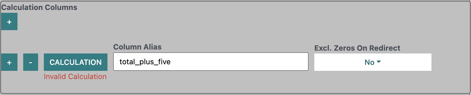
The next section is the Calculation columns.
Here we have a Calculation button opens a modal to specify the calculation we want to do.
The columns that are available for calculation are only columns selected in the Columns, Group By Columns and Value Columns section which are a number data type or a date.
Column Alias works the same as above.
Exclude Zeros On Redirect also works as above based on the filters specified on the Value Columns.
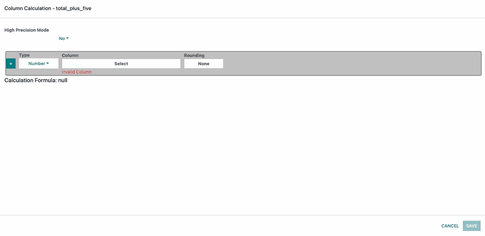
When we click on the Calculation Button this is what we see:
High Precision Mode - This setting has 2 options Yes and No(Default). If you are making calculations with floating point numbers and you want a very precise result for the floating point numbers then this mode should be turned on. If however you are not doing calculations with floating point numbers or small variations in precision are not important this can be left as No since when it is No the performance for the calculations is better. So this field allows you to pick what you want better perofrmance or higher floating point precision.
At the very bottom we have the Calculation Formula which visualises the Calculation that we have generated by selecting options. This is to make the builder easier to understand. Right now its null because we have nothing selected.
Above that we have the Calculation Builder section which has the first row by default. This is what we have in there:
Plus button - Adds another row.
Type - Its either Number or Brackets. Selecting brackets allows us to wrap numbers inside to ensure order of execution of the calculation and Number lets us have the Column option.
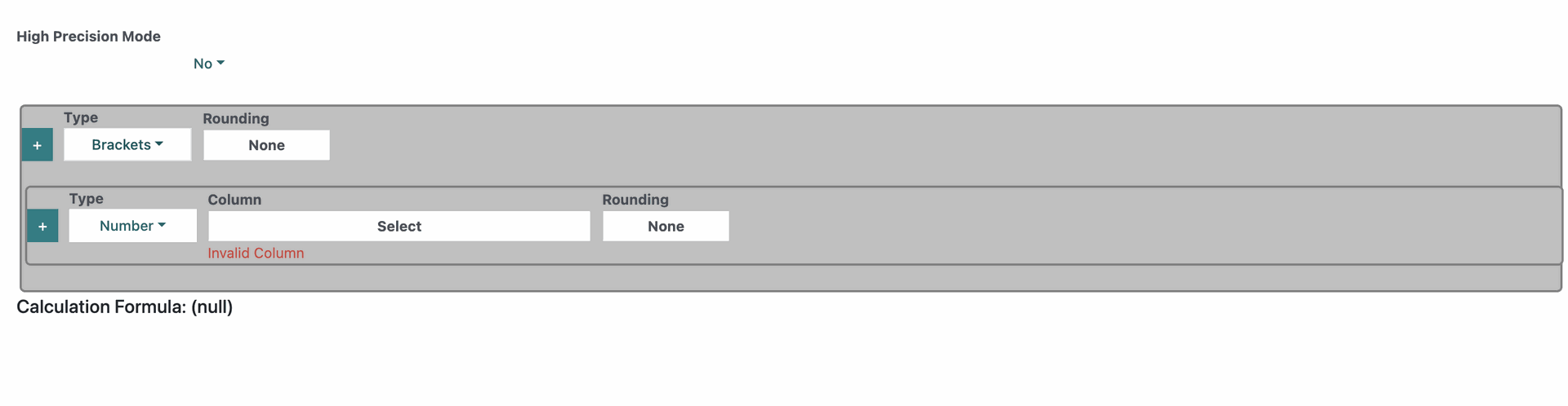
Type - Its either Number or Brackets. Selecting brackets allows us to wrap numbers inside to ensure order of execution of the calculation and Number lets us have the Column option.
In the example here we selected Brackets at the top which automatically added another row as a nested row for those brackets.
Notice also how in the Calculation Formula we now have Brackets around null.
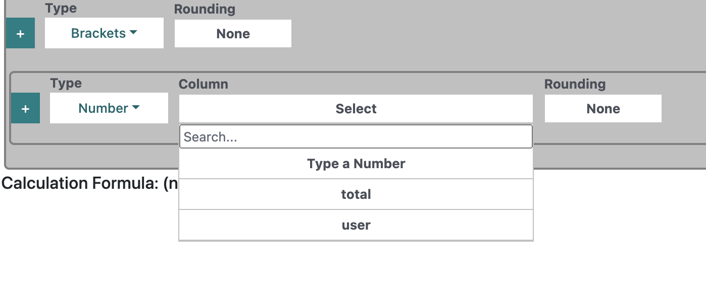
Column - so inside the column we can user which is part of the Group By Columns, total which is part of the Value Columns and Type a Number which allows us to freely input a number value.
Rounding - It has 4 options None(default), Up, Down, Round. In cases where we have floating point numbers this allows us to round up to the next number say in case we have 8.1 this would round to 9. Down rounds down lets say if we have a number that is 8.9 it would round to 8. and Round allows us to round the value down if its below .5 and up if its .5 or above. So if we have 8.5 this will round it to 9 but if we have 8.4 this would round to 8. We have this option available for both Brackets and Numbers. The difference is that Number rounds only that number while the Brackets Rounding rounds everything inside the Brackets.
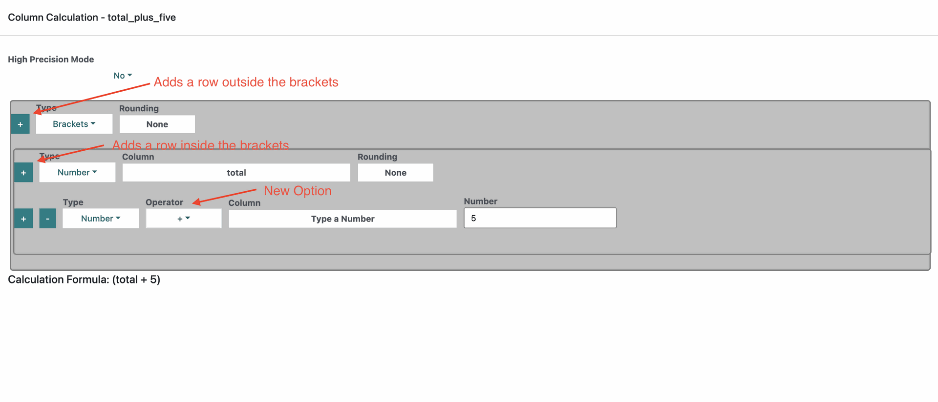
In the image you can see that i matters which button we will use to add another row. If we use the button on the brackets this will add a row outside the brackets and if we use the button inside the brackets this will add a row within the brackets.
So when we add a second row inside the brackets or outside the brackets this will reveal another option called Operator which are +(Add), -(Subtract), *(Multiply) and /(Divide).
In our example here is inside the brackets and you can see how the calculation formula has updated.
Once we have completed the calculation we want to achieve we just click on the Save button.
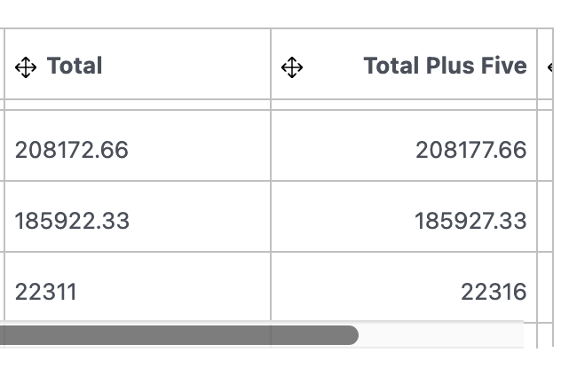
Once we have saved we can look at the Data Visualisation Grid and we can see that the Total Plus Five is always 5 more than Total.
Something else to keep in mind is that if there is no value in a row the row will be blank.
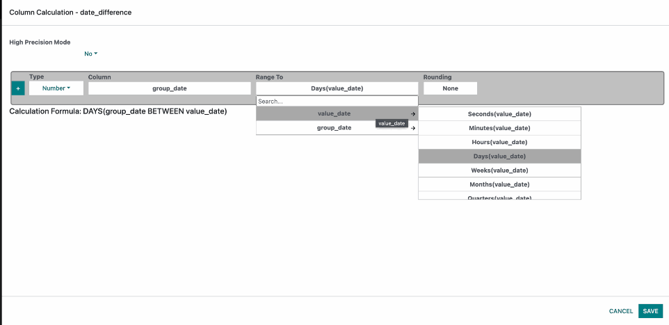
In this next example we have saved our previous Calculation Column and added another one. We also added a date Column inside the Group By Columns called group_date and another date Column inside the Value Columns called value_date so we can use it here to get the difference in a period of our choice.
So when we select a column that is a date in the Column option the Range To option will appear and in it we can only select a date column.
Every date column has the following options Seconds, Minutes, Hours, Days, Weeks, Months, Quarters, Years. They represent what the value generated will represent.
In this case we have selected Days. Notice the Calculation Formula.
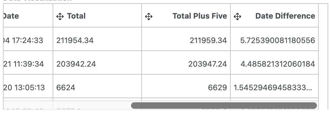
So here we can now see the Date Difference but it is a floating point number which may or may not be useful in the case of Days but we can change that.
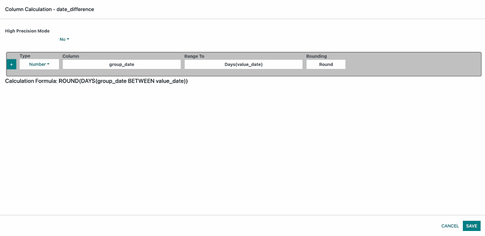
We can set the Rounding how we want and save.
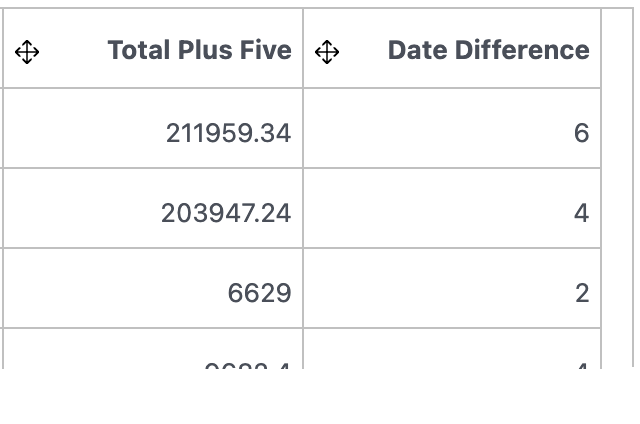
And now we can see the result is rounded.
So now the only thing left to do here is set the mapping. Now in the best case scenario it would be best to do the mapping id to id for example "so.id" should be mapped to Sales Order Id in Odoo but since we are Grouping in this instance we can map to the user in Sales Order since this is what we have in the Groups and this will bring us all grouped sales orders for the user.
After that we just have to Save and we can go back to the Custom Dataset List.
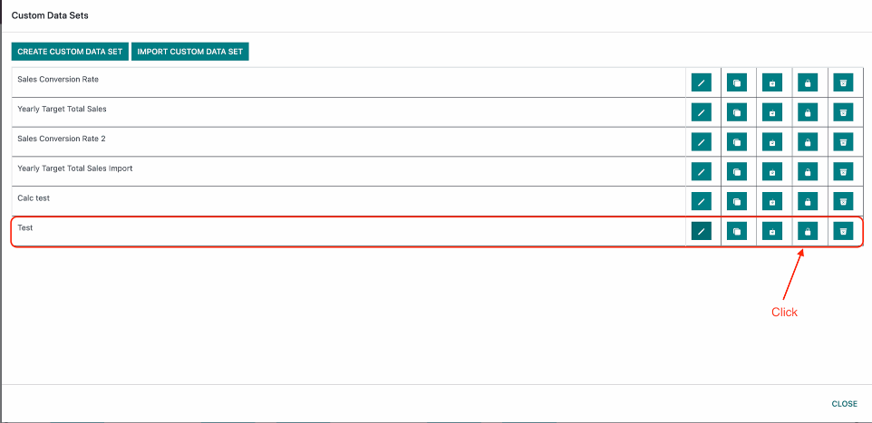
Once we save we will see our new Custom Dataset in the list but right now our custom dataset is not visible to anyone so we need to add access rights.
In the image you can see the arrow pointing towards the Security button. Click on it.
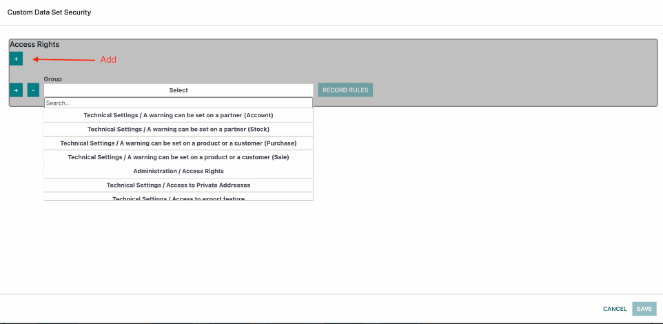
When the modal opens you will see access rights with only a + button. Press on it to add a row.
The row will have a Group and Record Rules.
Group contains the Odoo user groups. Select a user group you want to see the custom dataset.
You can add as many groups as you want.
Record Rules can be set on a per group basis. These record rules control what data from the dataset a user can see based on their group. For instance maybe you will want your manager to see data for his whole team while employees under him to see personal stats.
The record rules work in the same way as all the filtrations on the app and this section will be covered in the Filtration and Filtration hierarchy sections.
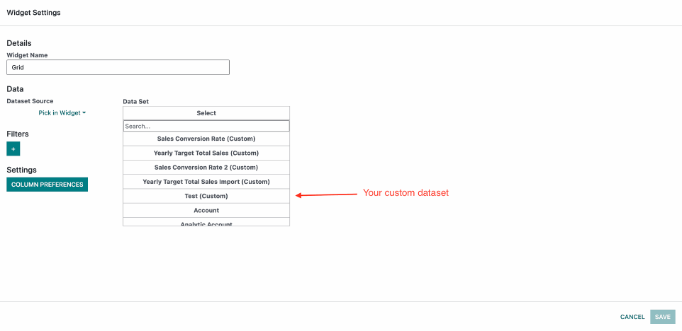
Now if you try to Create/Edit a Dashboard or Widget in the Dataset Dropdown you will see your new Custom Dataset.
Filtration Hierarchy
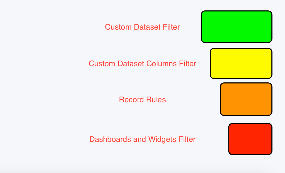
Hierarchy works down from top to bottom.
1. Custom Dataset filter filters data on the highest level as it has the most control over the data. This layers main idea for filtering is only to provide the data needed for the dataset as a whole. A good question to ask when you are setting a filter here is what is the maximum amount of data do I want any user no matter of position to have access to? Also who is the highest ranking person that is going to use this dataset? As a best practice its recommended to show data that is on a need to know basis only.
2. Then come the Custom Dataset Column Filters which are only available in the Value Columns. This filter only controls the values for that Column but it still is higher in the hierarchy because you can't change the value outside of the custom dataset.
3. Then come the record rules because they provide control on a user Group Basis. Here its more simple we only have to take into consideration how much data do we want the specific user group to see.
4. Finally the Dashboard and widgets filter comes last. Whatever was filtered out in the hierarchy above it can't be accessed. This filter is mainly intended for the customisation on a dashboard and widget basis of the data. As an example maybe we have data for a whole year but we want to see only the data for a month back for a specific widget or dashboard.
Filtration
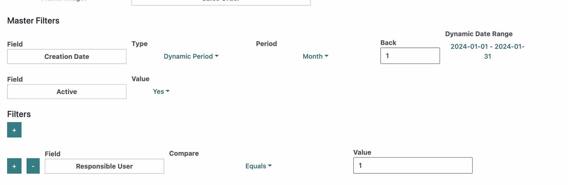
In our app filters have 2 possible types they are either Master Filters or Regular Filters.
Master Filters are only available on Dashboard and Widget level. Each dataset can have no master filters 1 or 2 at the most. The idea of the master filters is to limit the amount of data you can display. Some datasets have a lot of data and this is a way to limit the data to a certain period and also active only.
So if a dataset has either an Active field or Creation Data field they will have a master filter if not they wont have a master filter. The Creation Date Master filter can be changed to different dates as well since the Field option is a Dropdown. While the Active field cannot be changed.
Master Filters are always applied if we have any no matter the filter you apply below you cannot override them.
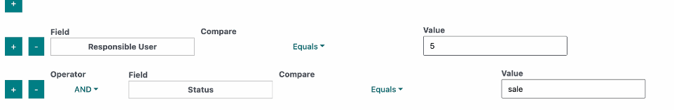
Now lets cover the regular filters. For them you can add as many conditions as you need. Each Added row has a + and - buttons and a Field option. The rest of the fields vary by the fields data types.
The Field option is a dropdown to select a field from the selected dataset. Once you do other fields will appear depending on the type. We have 4 different data types: Text, Number, Boolean and Date.
Now lets go over them.
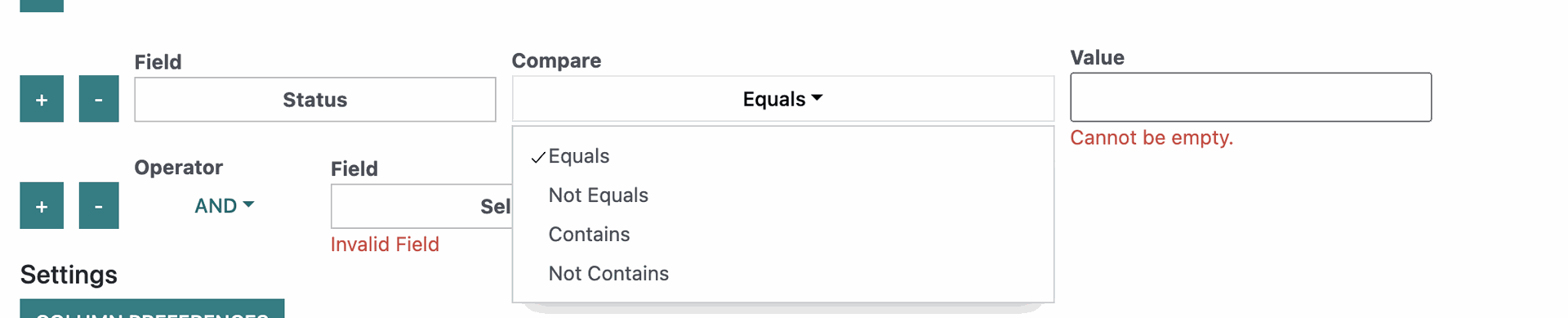
Text Data Type
The Text data type has 2 options for it Compare and Value.
Compare has 4 options Equals, Not Equals, Contains and Not Contains.
You can enter anything you would like as the value there but as it says it cannot be empty.
There are also special keywords for the Value field:
${userId} - The user currently used(You)
${companyId} - The company that is for this account.
${null} - When we are looking for rows where the field does not have a value.
An easy way to think of how to use this is:
Get all the data where the field Status is equal to "some value" or maybe Get all the data where the field Status contains in its text "some value"("some value" in "Here is some value for you.")
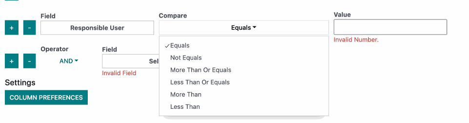
Number Data Type
The Number data type has 2 options for it Compare and Value and its very similar to Text Data type.
Compare has 6 options Equals, Not Equals, More Than Or Equals, Less Than Or Equals, More Than, Less Than.
You can only enter numbers in the Value field and also the special keywords:
${userId} - The user currently used(You)
${companyId} - The company that is for this account.
${null} - When we are looking for rows where the field does not have a value.
An easy way to think of how to use this is:
Get all the data where the field Responsible User is More Than Or Equal to 5.
Another Great Example is also get all the data where the field Responsible User is equal to ${userId}
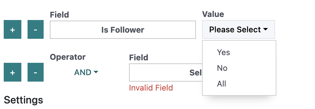
Boolean Data Type
The Number data type has 1 option only and its Value.
Value is a dropdown that contains 3 options Yes, No and All.
A great way to think about this is:
Get all data where the field Is Follower is Yes.
Date Data Type
The Date Data Type is the most complex.
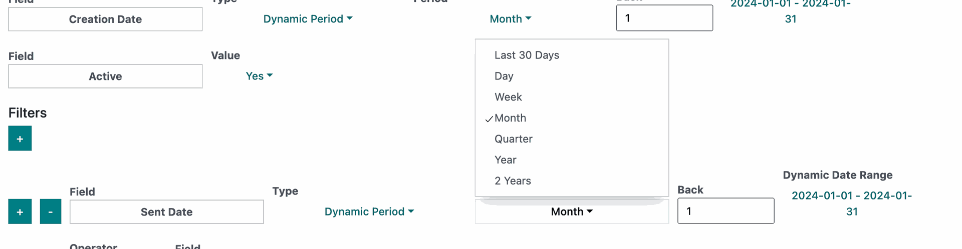
First think is it has a Type which has 2 values Dynamic Period and Static Period.
Here is what we see when we have the Dynamic Period which works relative to the current date.
We have a Period option which is a dropdown and it has the following options:
Last 30 Days, Day, Month, Week, Month(Default), Quarter, Year, 2 Years.
This Period acts as a Range.
After that we have the Back option which accepts a number as input. This option is used to go back with N amount of periods in time.
At the end appears the currently selected date range as you can see.
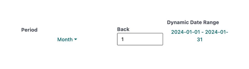
Example 1:
Today is 16/02/2024 and we have selected as Period Month and Back 1.
You can see the range comes to 01/01/2024 - 31/01/2024
The reason for that is that when we select the period month this only gets the current month which is February and then Back goes back with 1 Period so that brings it to January and we get the whole month of January as a Range. As time goes by if the current date becomes 01/03/2024 then the range will become the whole month of February since this type of date selection is designed to be dynamic so you don't have to update it each month, year etc.
Day, Week, Month, Quarter, Year and 2 Years all work in the same way.
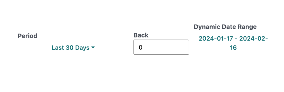
Example 2:
Today is 16/02/2024 and we have selected as Period Last 30 Days and Back 0.
You can see the range comes to 17/01/2024 - 16/02/2024
The reason for this is that unlike month, last 30 days ends at todays date. So if we go back 1 we will go back 60 days.
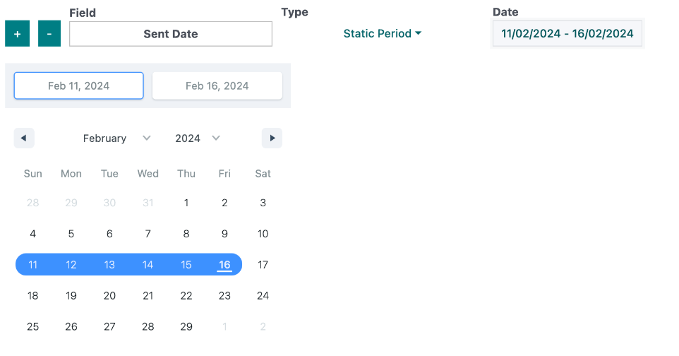
Static Period
In Static Period we have only one option which is Date.
This opitons opens a Date Picker that is clickable and you can select a range between 2 dates.
This covers the last piece of Date Data Type.
Now to cover the last piece of filtration.
If we add a second line we have an Operator option appear before the field.
It has 2 possible values AND & OR.
Their idea is to decide if you want to combine 2 or more conditions or create separate conditions that the data can meet.
Each line after the first one has an Operator option.
A good way to think about it is this:
Get all the data where Responsible User Equals 5 and/or status equals sale.
Caching
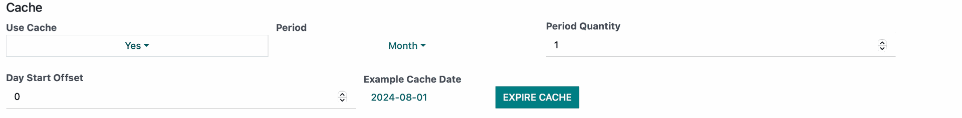
Caching is available inside Dashboard Settings and inside Widget Settings(if you have selected Dataset Source "Pick in Widget")
Use Cache - Used to enable the cache
Period: Day, Week, Month, Quarter, Year(The period type you want to use. Example: Month would select the current month and cache will expire at the end of the month)
Period Quantity: This is a period multiplier (Exmaple: Select period month and set period quantity to 2 this would set the expiration for the end of next month and will expire every 2 months)
Day Start Offet: Used to offset the start date. By default if you select month the period starts from the 1st of each month and if you input 15 this would offset by 15 days to set it to the middle of the month.
Example Cache Date: this displays an example expiry date based on the current date so you get an idea how the cache would be set to expire if you cache in the current moment in time.
Expire Cache: If you have cached data already but want to expire it this button allows you to expire it before its expiraiton date. This button only expires what its relative to. (Example: if you click this button inside dashboard settings this would only expire the cache for the widgets relative to the dashboard settings. If you have any widgets that have a Data Source "Pick in Widget" you would need to expire that cache for those individually.)
Account Settings
Account Settings allows us to:
Change Scope, Change/Reset Password, Change Account Details, Logout and Manage the Allowed Users
We will dive into managing users and scopes in this section.
Scope
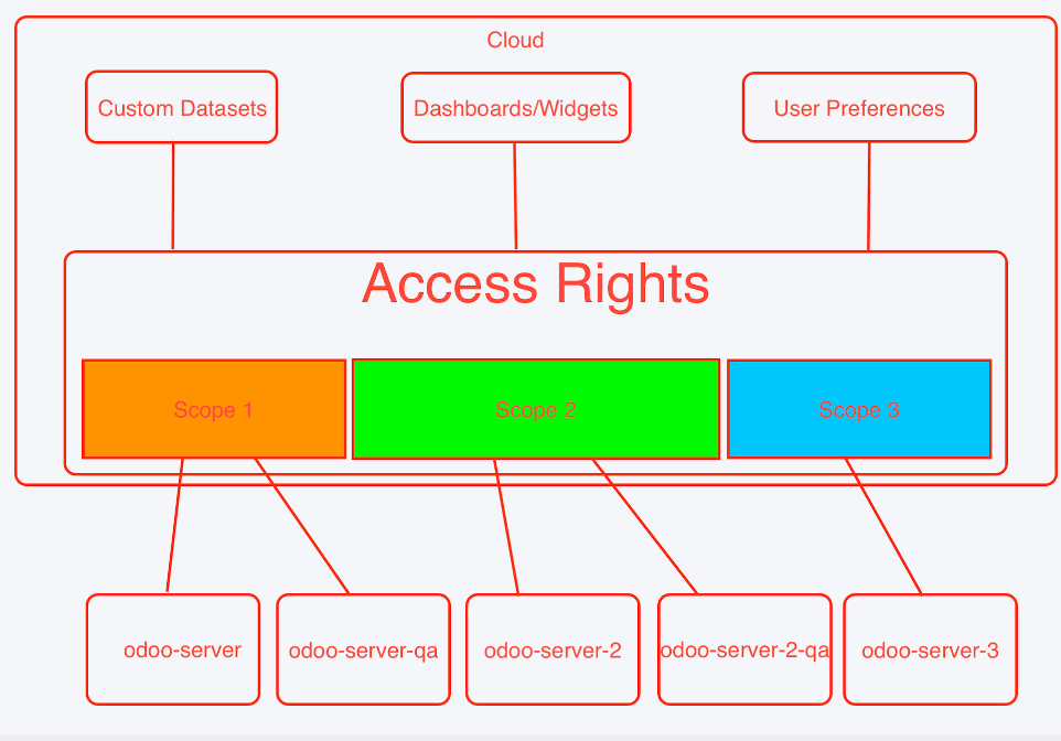
The Scope in our application allows you to take advantage of our cloud based storage.
All of the Custom Datasets, Dashboards, Widgets, Access Rights, User Preferences are all stored in the cloud and this is very useful as you don't have to worry about losing your saved preferences and you can easily share them between different environments.
When we have multiple environments its not always optimal to share all of your preferences with the different environments and this is where Scopes come in.
Scopes lets you control the data you want to share with each environment.
Example:
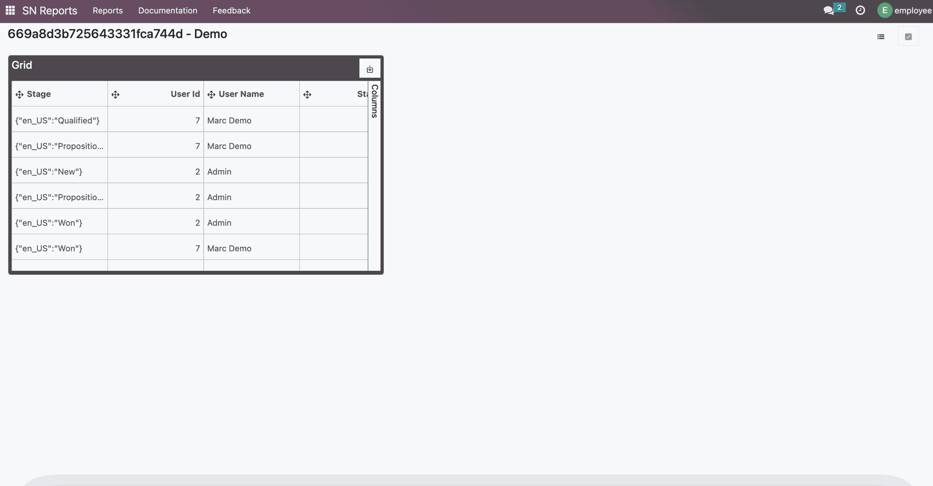
Starting out we have a dashboard called Demo which is set as default currently we are looking at the Admin profile. It also has selected a dataset called test4 which has provided access rights to the Internal User Group.
We have also provided access rights to the Internal User group in order for a standard user to have access and we have also set the dashboard to default for an employee user for this demo and this is what the dashboard looks like for a standard employee.
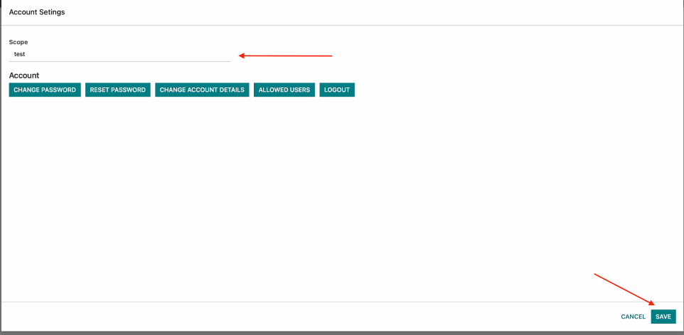
Once this is all setup we will go ahead and change the Scope. Go into Account Settings and you will see the current screen. Change the scope to a new value like test2 and click Save and the browser will be refreshed.
The first thing you will notice is that both users no longer open the default dashboard. This is because user preferences are only stored based on scope and they cannot be transferred.
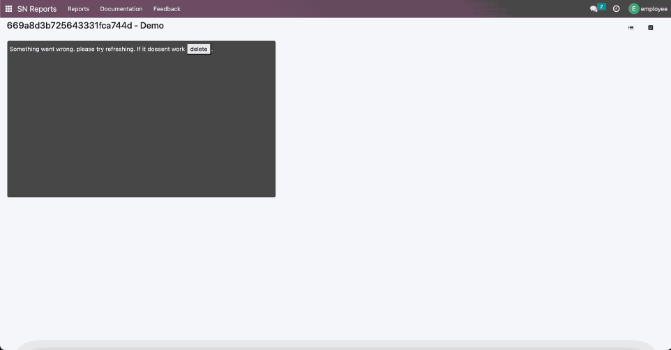
You will also notice that on the employee user that he now does not see any dashboards and even if he has access rights to create dashoards he wont see any datasets either. This is because he does not have any access rights for this scope.
But if we open the Dashboards List for the Admin its another story. He can still see all of the dashboards.
This is because Admin users have special access which allows them to see Dashboards that they don't have provided access for. They can even open them.
If you open the access rights for any Dashboard you will see in fact that there are no access rights for this scope but an Admin user can add access rights to dashboards that he wants shared between scopes.
In this image we have already provided access to the Internal User Group but as you can see we are getting an error not matter if we open with the Admin User orthe Employee user. The reason for this is because the Custom Datasets and Model Security Access rights are also scoped and they need to be provided for both users or just the internal user group.
Just like in the Dashboards List inside the Custom Datasets the Admin user can see all Custom Datasets without any access rights so we can add access rights to the current scope.
Once we provide say the Interal User Group to the Custom Dataset diplayed on the Dashboard we are now able to see the data and everything works as expected. The same goes for the Model Security as well.
Odoo SN Reports Access Rights
WARNING:
SOME OF THE MODELS ARE NOT MEANT TO BE RESTRICTED IN ODOO BECAUSE THEY ARE PART OF THE CORE FUNCTIONALITY. ONLY CHNAGE MODELS THAT ARE LISTED IN THIS GUIDE.
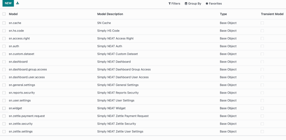
The image shows the SN Reports models in Odoo.
The Odoo access rights are different to the access rights we can set to Custom Datasets and Dashboards. The Odoo access rights have precedence over the in app access rights.
Model Security Access Rights
The Model Security button becomes available when the User or Group has one or both of the following models:
sn.custom.dataset: has one or more of the following access rights: CREATE, WRITE, UNLINK
sn.access.right: has all of the following access rights: CREATE, WRITE, UNLINK
By default this access is given to the admin group.
IMPORTANT: READ ACCESS SHOULD ALWAYS REMAIN ALLOWED TO USER GROUPS AND USERS THAT HAVE ACCESS TO SN REPORTS FOR ALL SN REPORT MODELS.
Custom Dataset Access Settings
The Custom Dataset button becomes available when the User or Group has one or both of the following models:
sn.custom.dataset: has one or more of the following access rights: CREATE, WRITE, UNLINK
sn.access.right: has all of the following access rights: CREATE, WRITE, UNLINK
By default this access is given to the admin group.
IMPORTANT: READ ACCESS SHOULD ALWAYS REMAIN ALLOWED TO USER GROUPS AND USERS THAT HAVE ACCESS TO SN REPORTS FOR ALL SN REPORT MODELS.
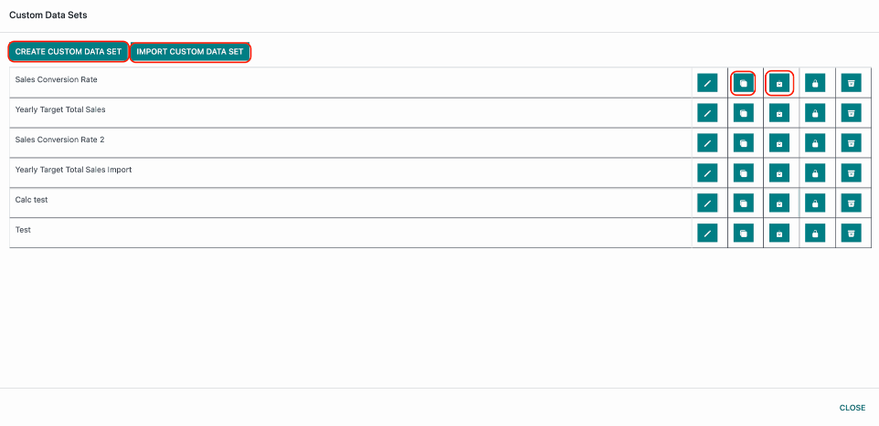
Inside the Custom Data sets modal the buttons highlighted in red(Create, Duplicate, Export, Import Custom Data Set) become visible when:
sn.custom.dataset: has the following access right: CREATE
By default this access is given to the admin group.
IMPORTANT: READ ACCESS SHOULD ALWAYS REMAIN ALLOWED TO USER GROUPS AND USERS THAT HAVE ACCESS TO SN REPORTS FOR ALL SN REPORT MODELS.
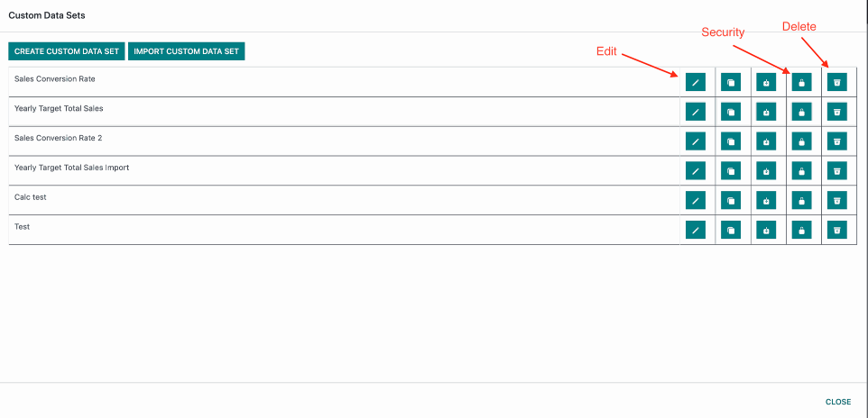
Inside the Custom Data sets modal:
Edit Button becomes visible when sn.custom.dataset has the following access right: WRITE
Security Button becomes visible when sn.access.right has all the following access rights: CREATE, WRITE, UNLINK
Delete Button becomes visible when sn.custom.dataset has the following access right: UNLINK
By default this access is given to the admin group.
IMPORTANT: READ ACCESS SHOULD ALWAYS REMAIN ALLOWED TO USER GROUPS AND USERS THAT HAVE ACCESS TO SN REPORTS FOR ALL SN REPORT MODELS.
Account Settings Access Rights
The Account Settings button becomes visible when sn.general.settings has the following access rights: READ, WRITE, CREATE, UNLINK.
By default it is given to the admin group.
Dashboards/Widgets Access Settings
On the main dashboard control center:
Locked/Unlocked(Only visible on mobile devices) Button becomes visible when sn.dashboard has the following access right: WRITE
Save Dashboard Button becomes visible when sn.dashboard has the following access right: WRITE
Dashboard Settings Button becomes visible when sn.dashboard has the following access right: WRITE
Clone Dashboard Button becomes visible when sn.dashboard has the following access right: CREATE
Delete Dashboard Button becomes visible when sn.dashboard has the following access right: UNLINK
Add Widget Button becomes visible when sn.widget has the following access right: CREATE(Keep in mind tha you wont be able to save without sn.dashboard WRITE access.)
Set As Default Dashboard Button becomes visible when sn.user.settings has the following access right: WRITE
IMPORTANT: READ ACCESS SHOULD ALWAYS REMAIN ALLOWED TO USER GROUPS AND USERS THAT HAVE ACCESS TO SN REPORTS FOR ALL SN REPORT MODELS.
On the widgets control center:
Widget Settings Button becomes visible when sn.widget has the following access right: WRITE
Clone Widget Button becomes visible when sn.widget has the following access right: CREATE
Delete Widget Button becomes visible when sn.widget has the following access right: UNLINK
IMPORTANT: READ ACCESS SHOULD ALWAYS REMAIN ALLOWED TO USER GROUPS AND USERS THAT HAVE ACCESS TO SN REPORTS FOR ALL SN REPORT MODELS.
In the Dashboard List modal:
Create Dashboard Button becomes visible when sn.dashboard has the following access right: CREATE
Access Button becomes visible when sn.dashboard.group.access has the following access rights: CREATE, WRITE, UNLINK and sn.dashboard.user.access has the following access rights: CREATE, WRITE, UNLINK.
IMPORTANT: READ ACCESS SHOULD ALWAYS REMAIN ALLOWED TO USER GROUPS AND USERS THAT HAVE ACCESS TO SN REPORTS FOR ALL SN REPORT MODELS.